A Music Brand Designed Around the Artist's Identity
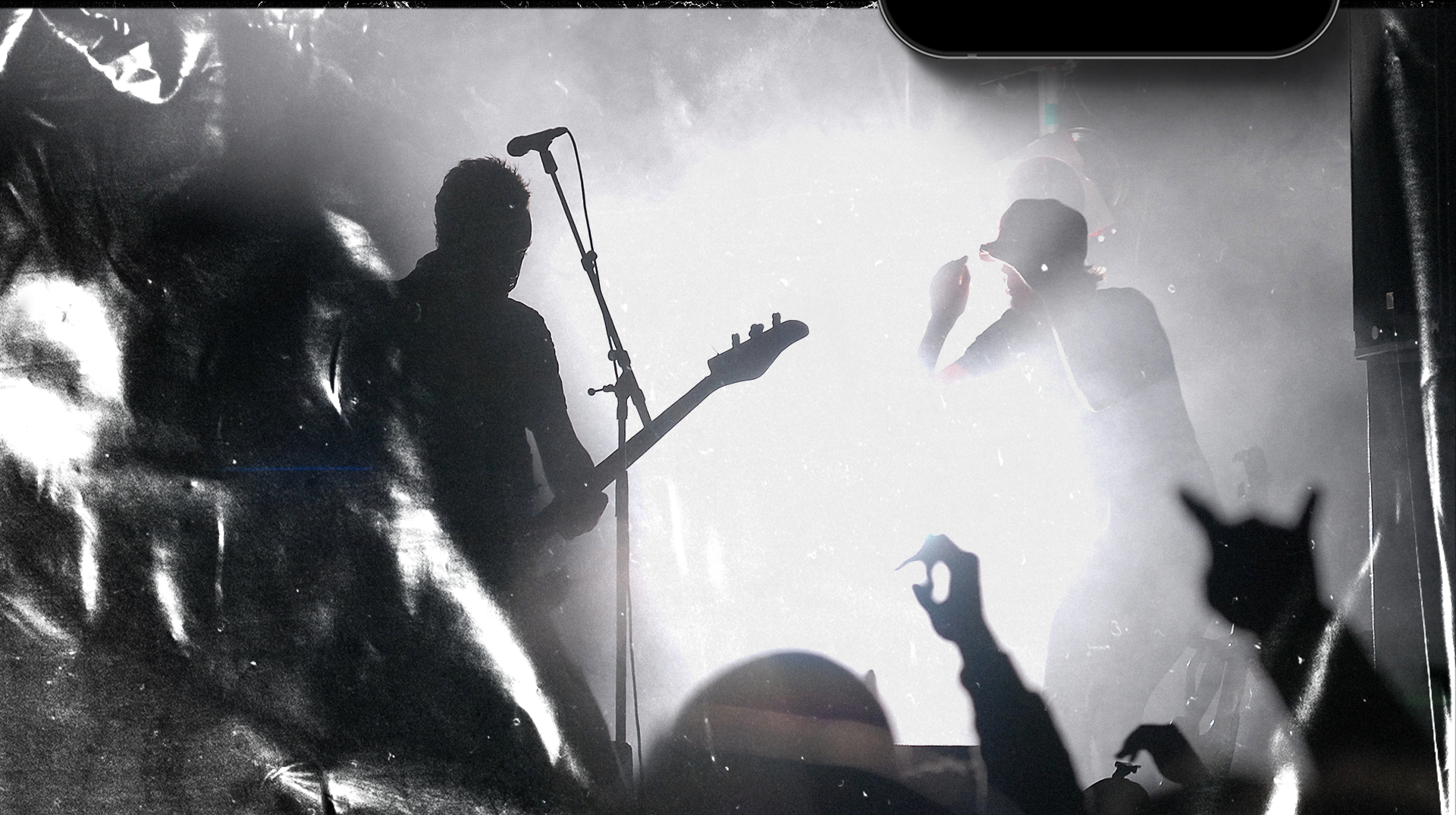
Rick Rain is a Brazilian musician whose work sits at the intersection of rock and romantic songwriting — a combination that informed every visual decision in this project. The challenge was to translate a complex artistic identity into a single, coherent mark.
This project was developed as part of an academic competition (CSC), in which university students across design, advertising, and related fields develop full communication projects for real clients. Art direction was a collaboration between myself and Marcelo Trevizan, with planning by Douglas Figueiredo and Marilu Dallanora.
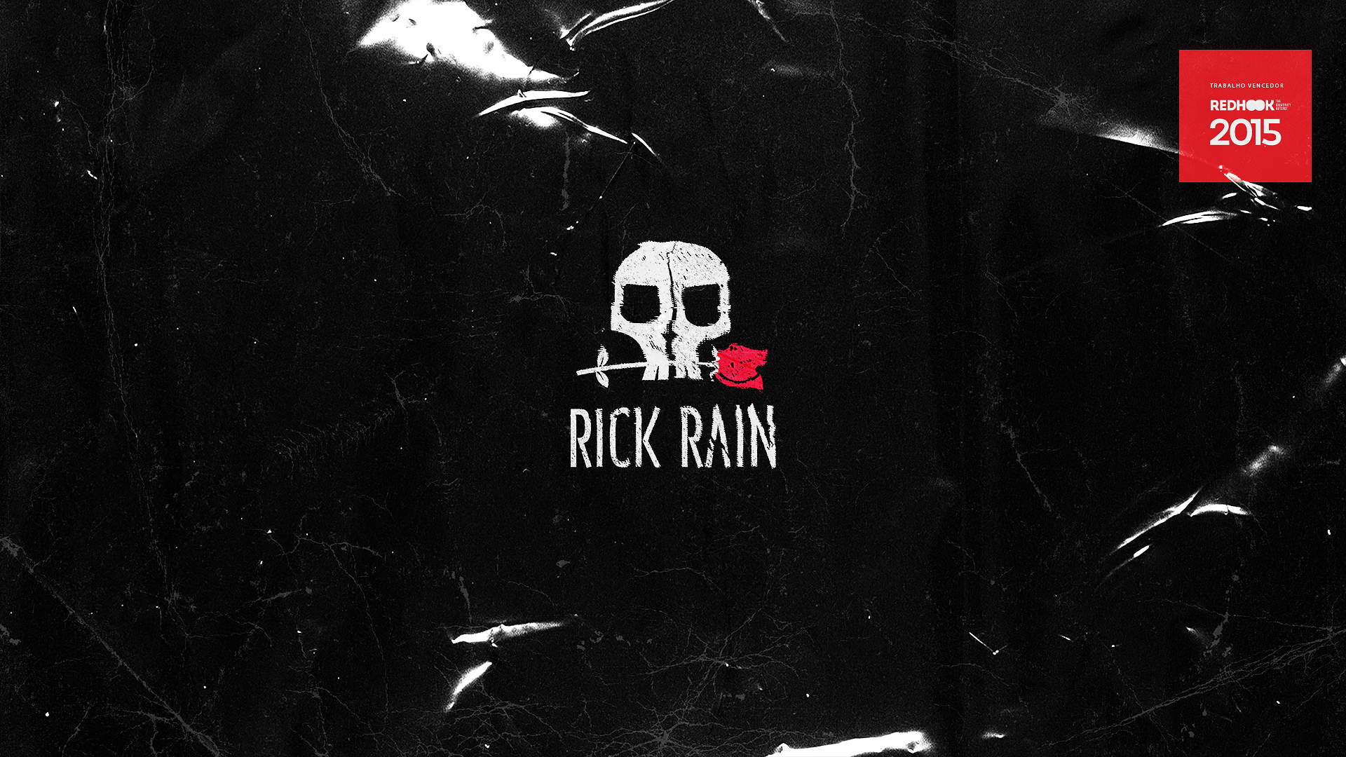
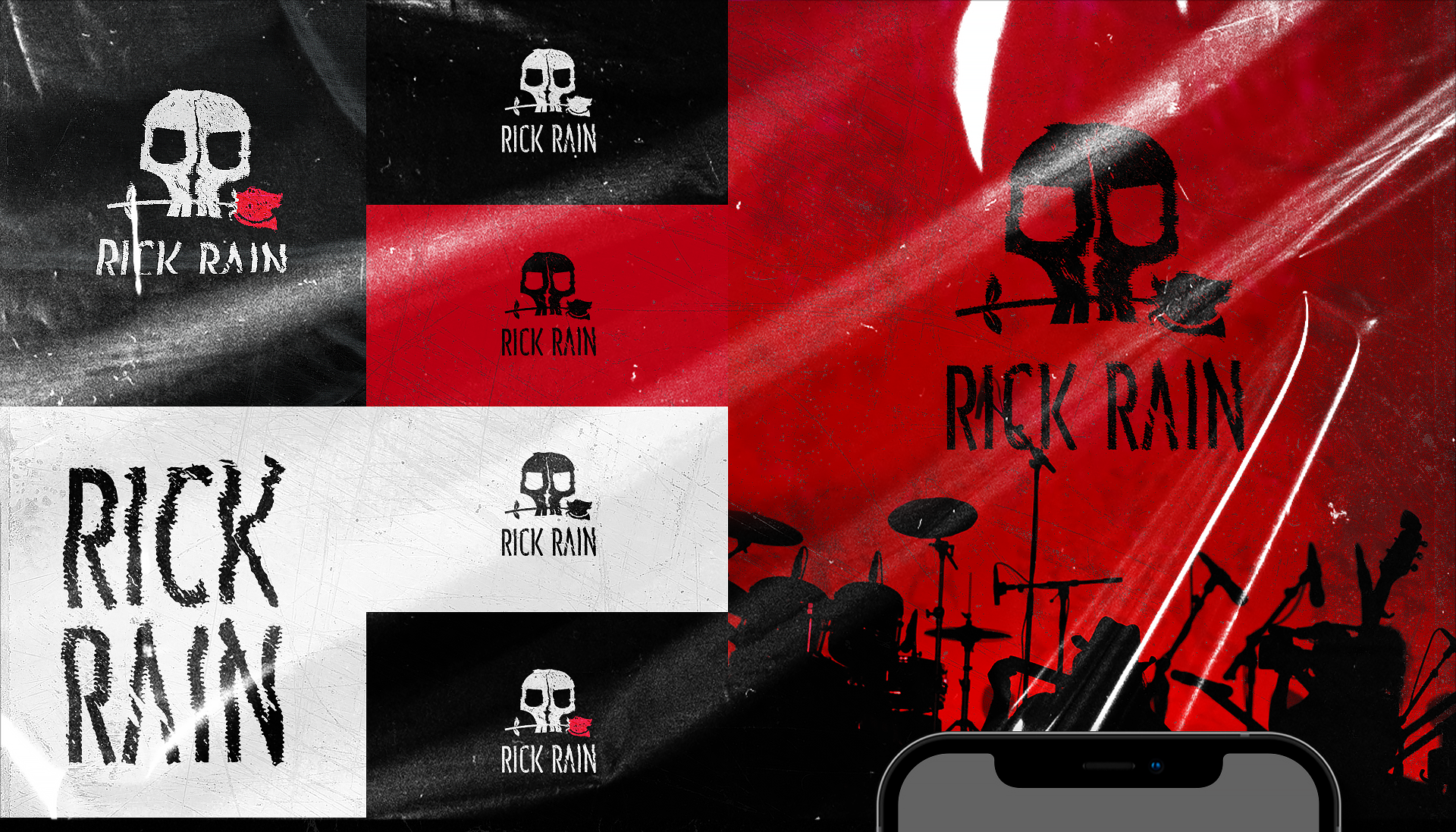
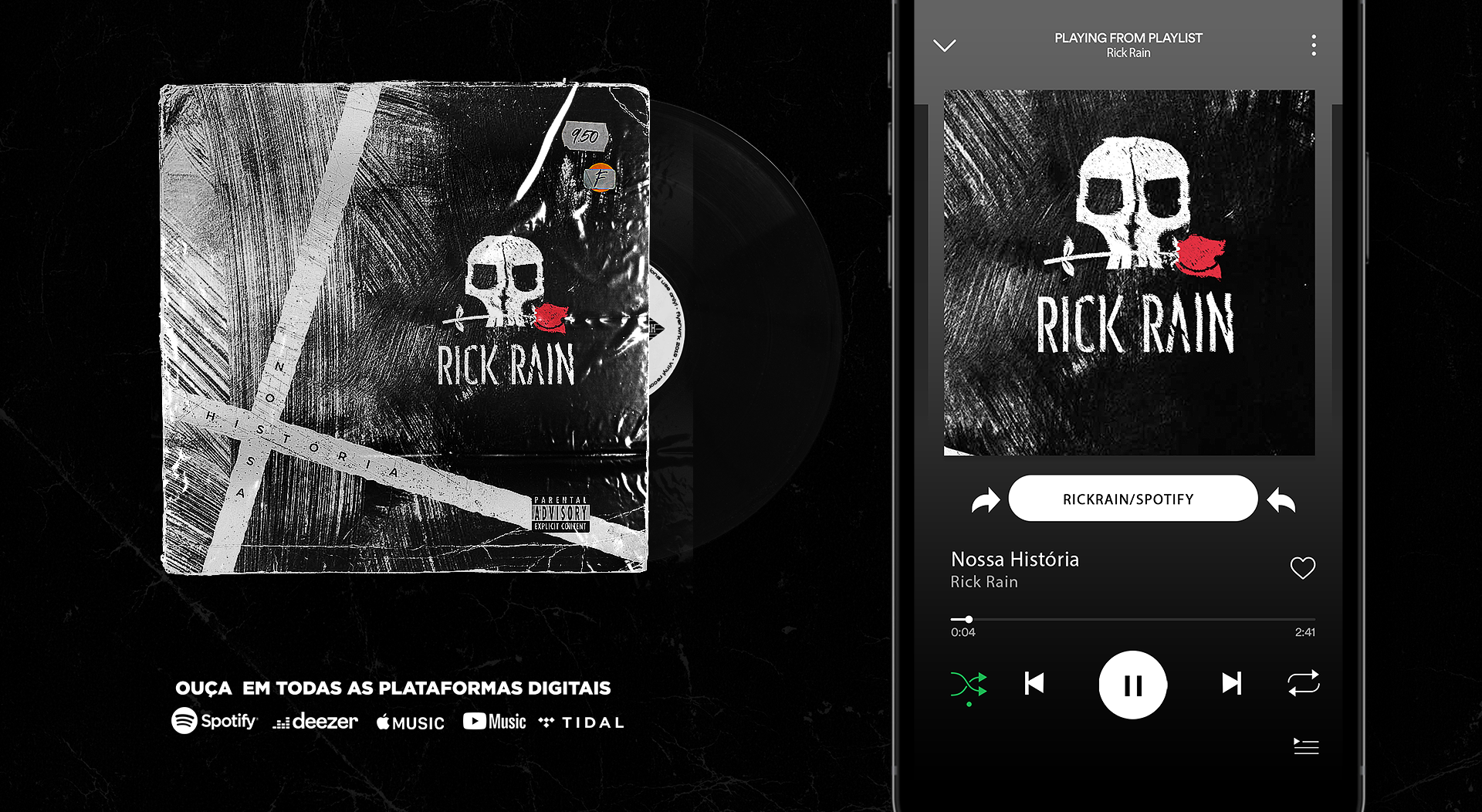
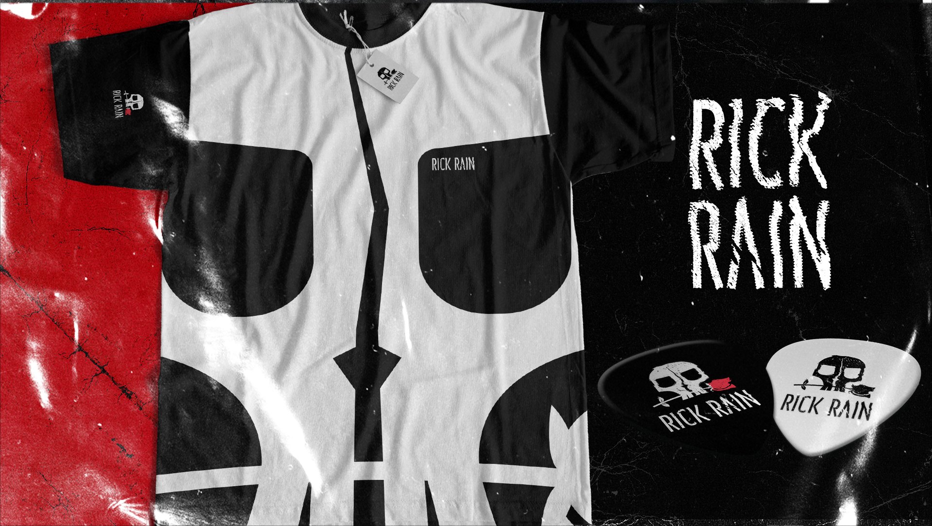
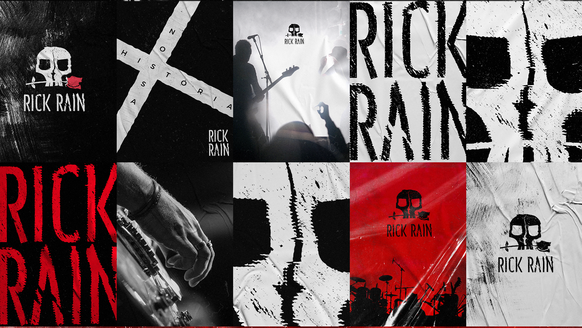
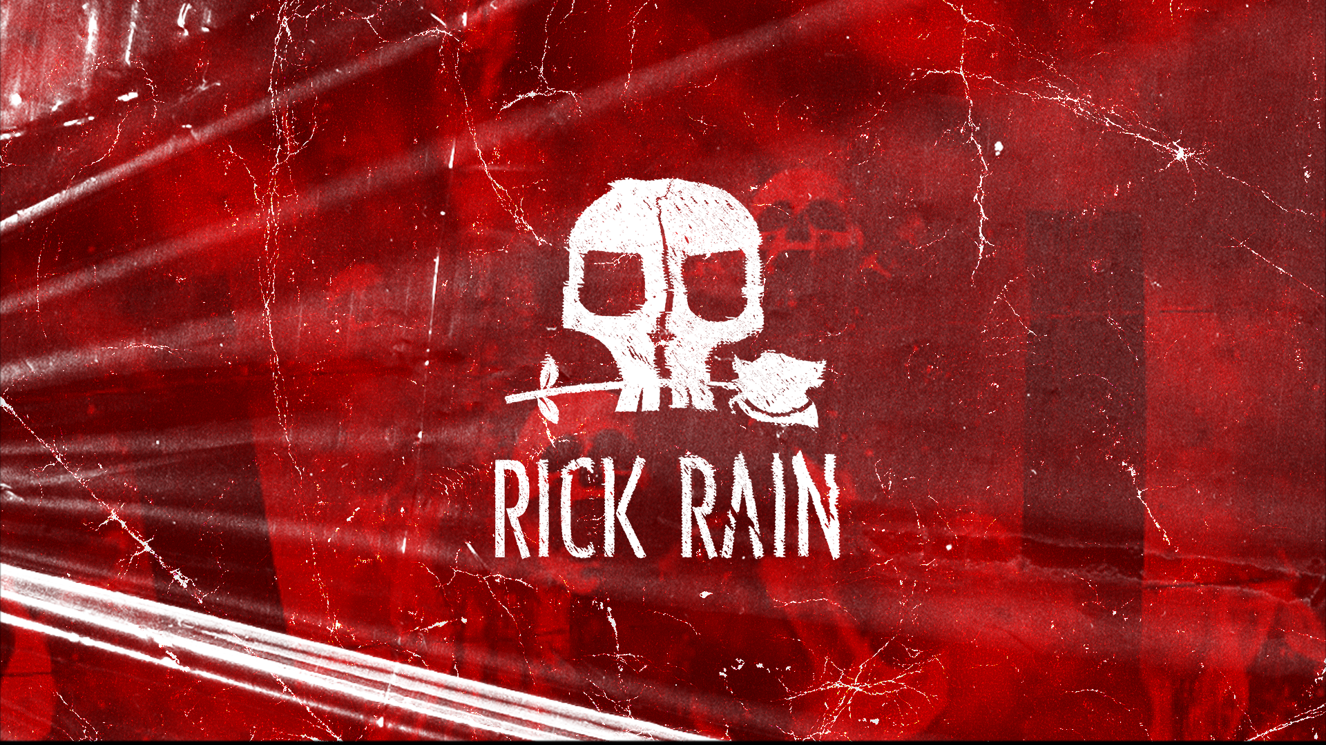
The central icon is a monogram built from two R's — the initials of Ricardo (Rick) — shaped and refined until the letterforms resolve into a skull. The skull is a loaded symbol in rock culture, but it carries a secondary meaning that felt right for this artist: the human form in its most essential state, a reminder of the equality between all people. Combined with the rose motif — a nod to the romantic dimension of Rick's music — the mark holds both sides of the artist's identity in a single, unified form.
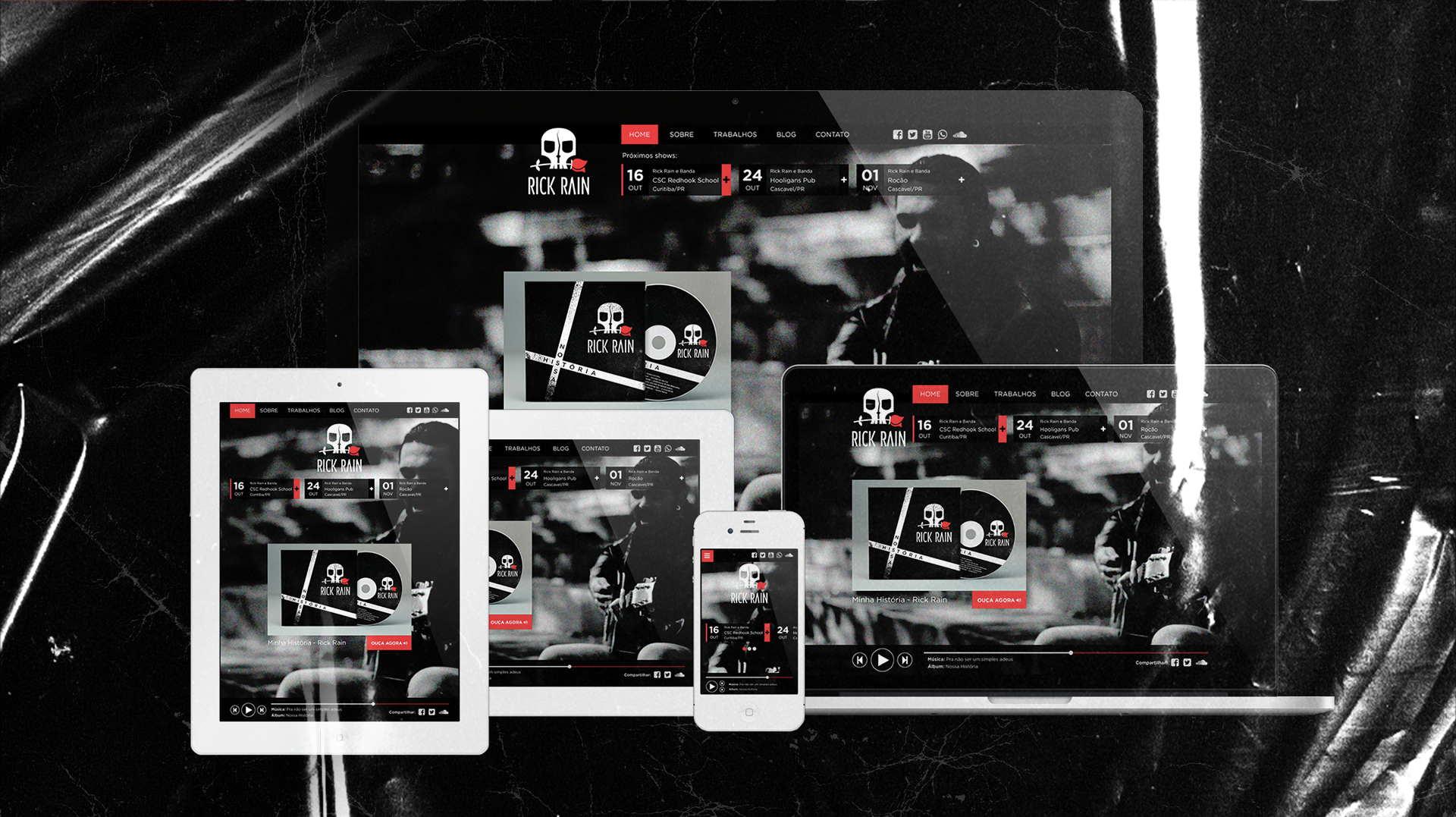
Typography was custom-refined to work in dialogue with the icon. The palette of black, white, and texture reinforces the central concept of the album: the tension between opposites — happiness and sorrow, love and solitude, together and apart.


Client: Rick Rain · Academic Project (CSC)
Role: Art Director / Brand Designer · Co-direction: Marcelo Trevizan · Planning: Douglas Figueiredo & Marilu Dallanora