A Financial Brand Built Around People, Not Products
Allied Wealth Planners isn't a typical financial advisory firm. Their business is built around one principle: real relationships first. No corporate quotas, no product pushing — just honest advice, transparent planning, and one advisor who sees the full picture.
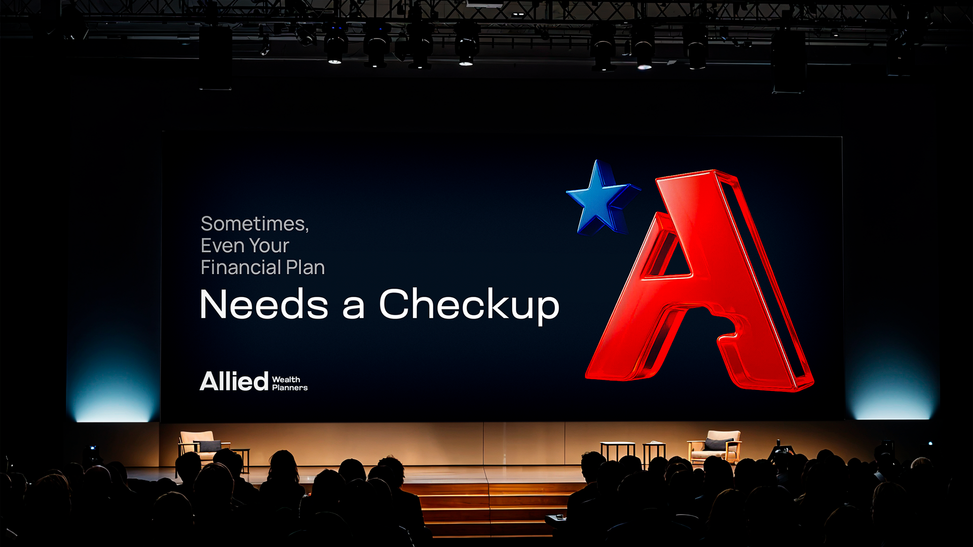
The brief was to build an identity that communicates exactly that. Professional and credible, but personal in a way that most firms in the category aren't.
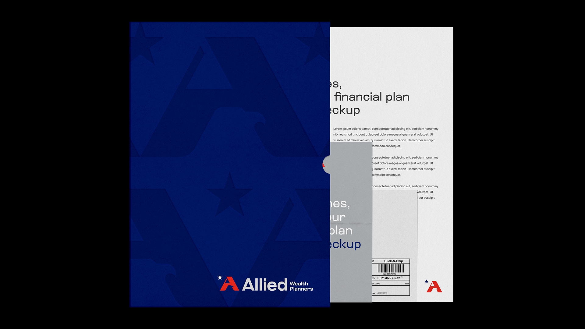
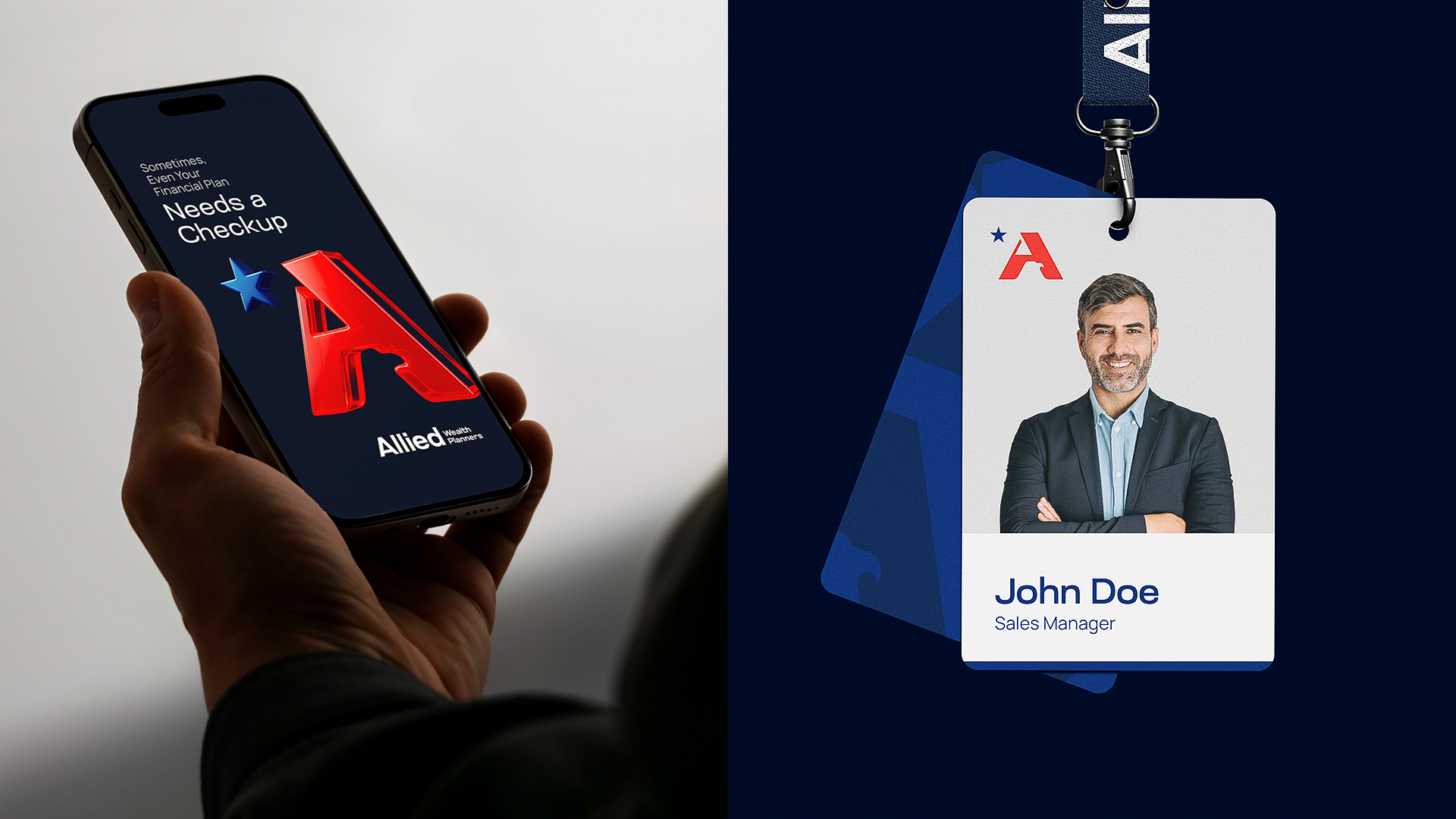
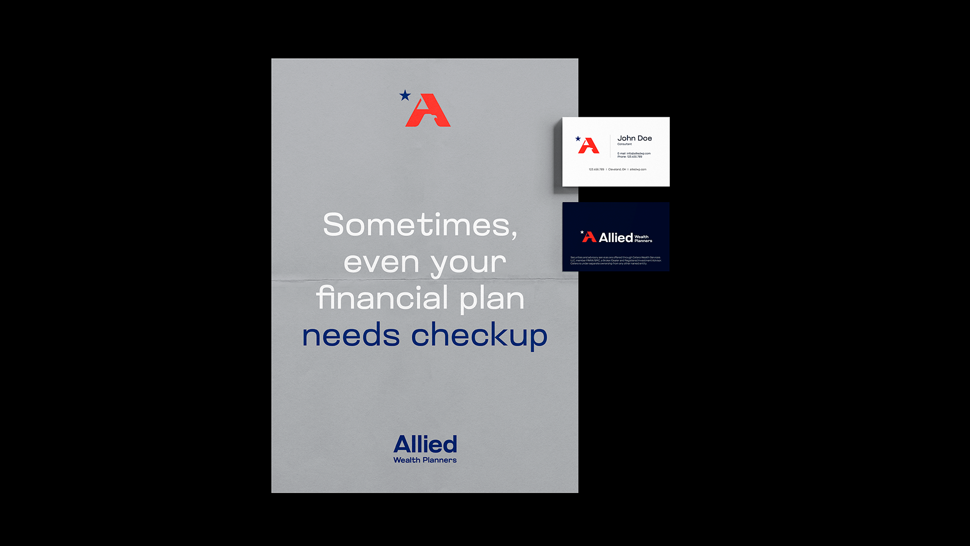
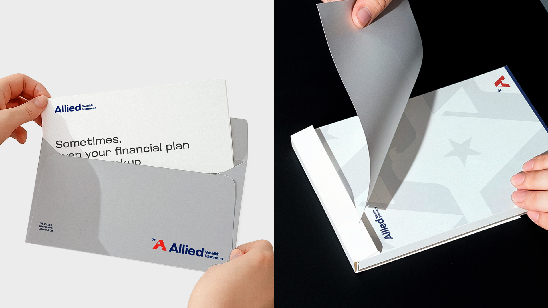
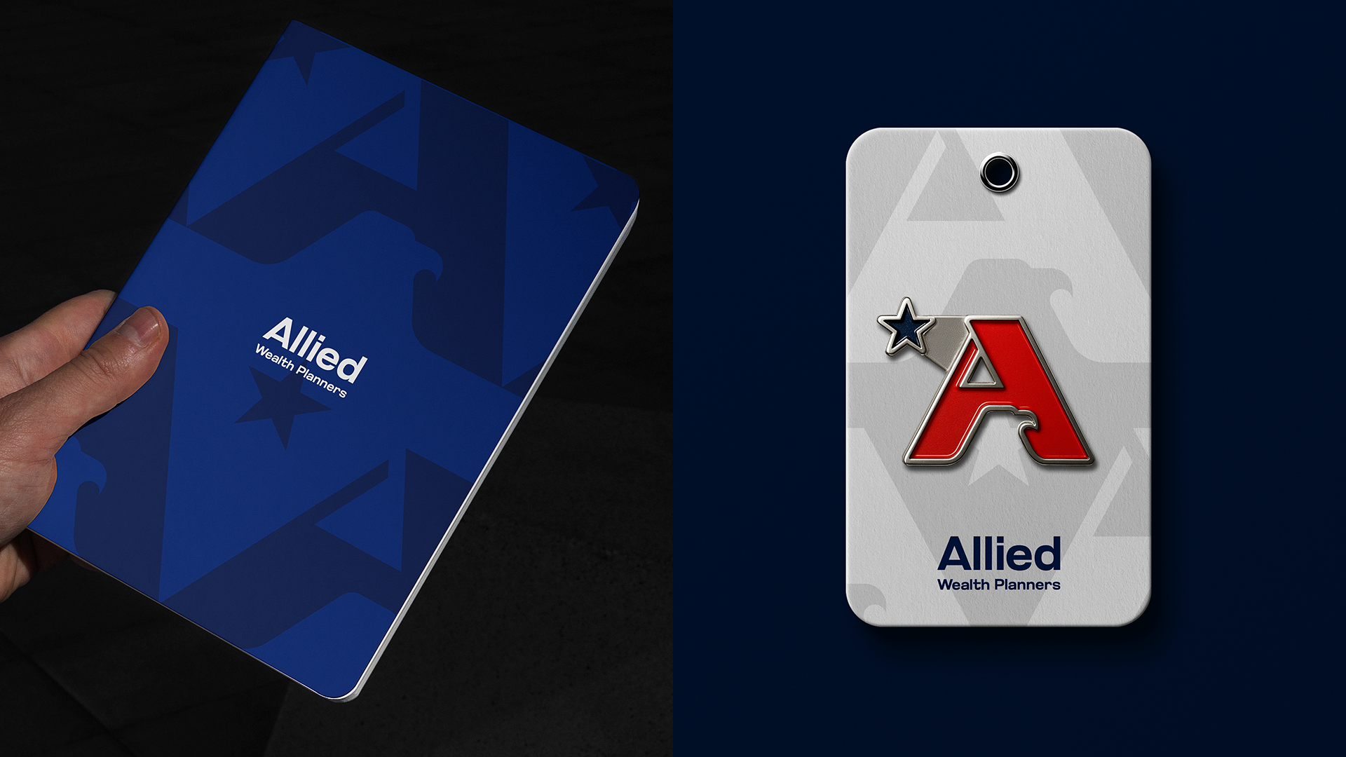
I led the full brand identity and website design through BrandDog. The visual direction trades financial sector conventions for clarity: clean typography, a confident palette, and a mark with real intention behind it.
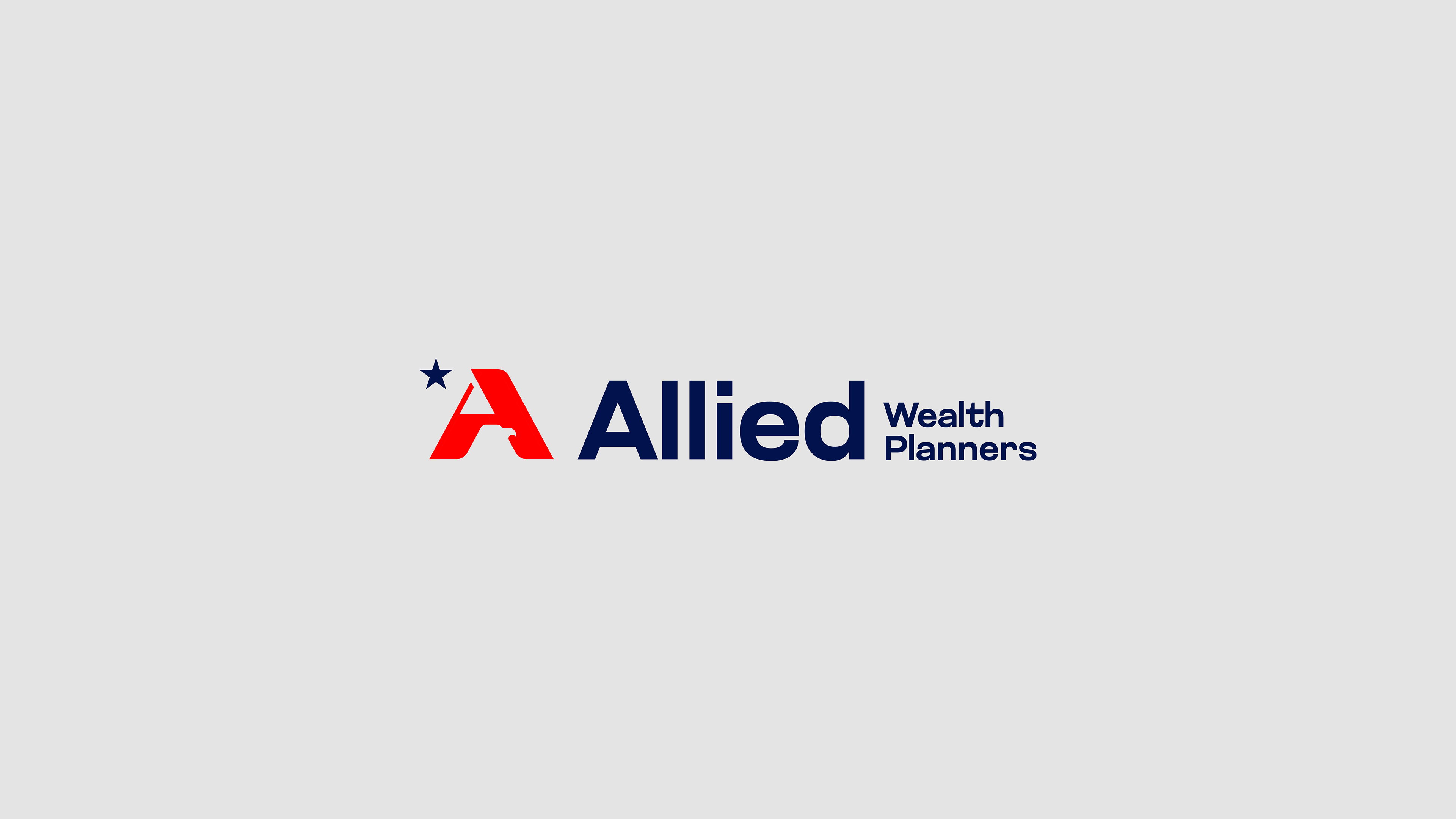
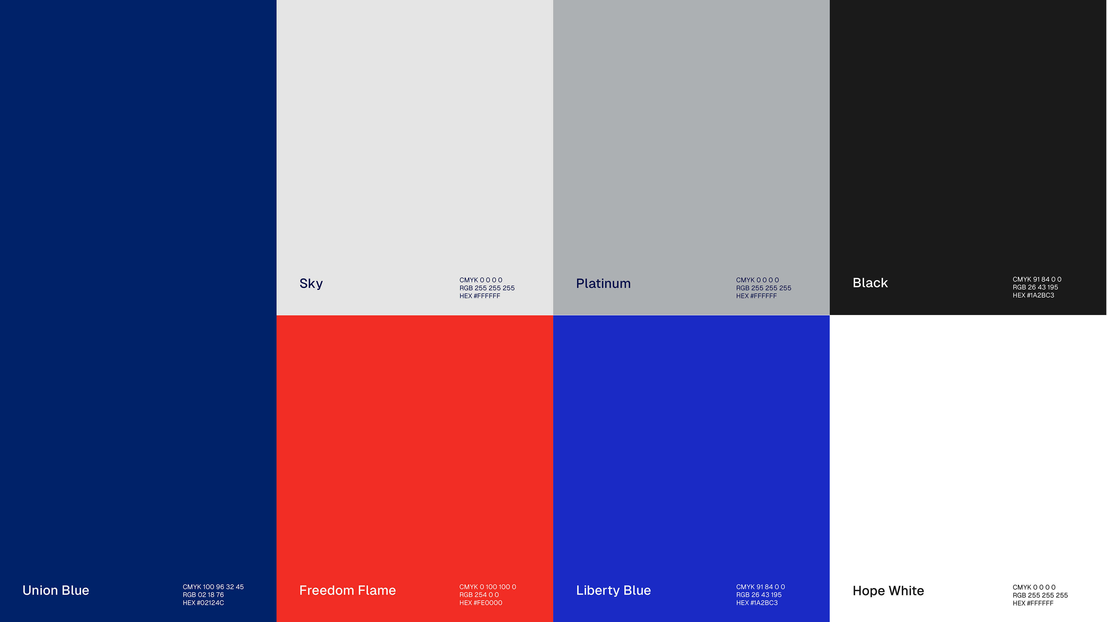
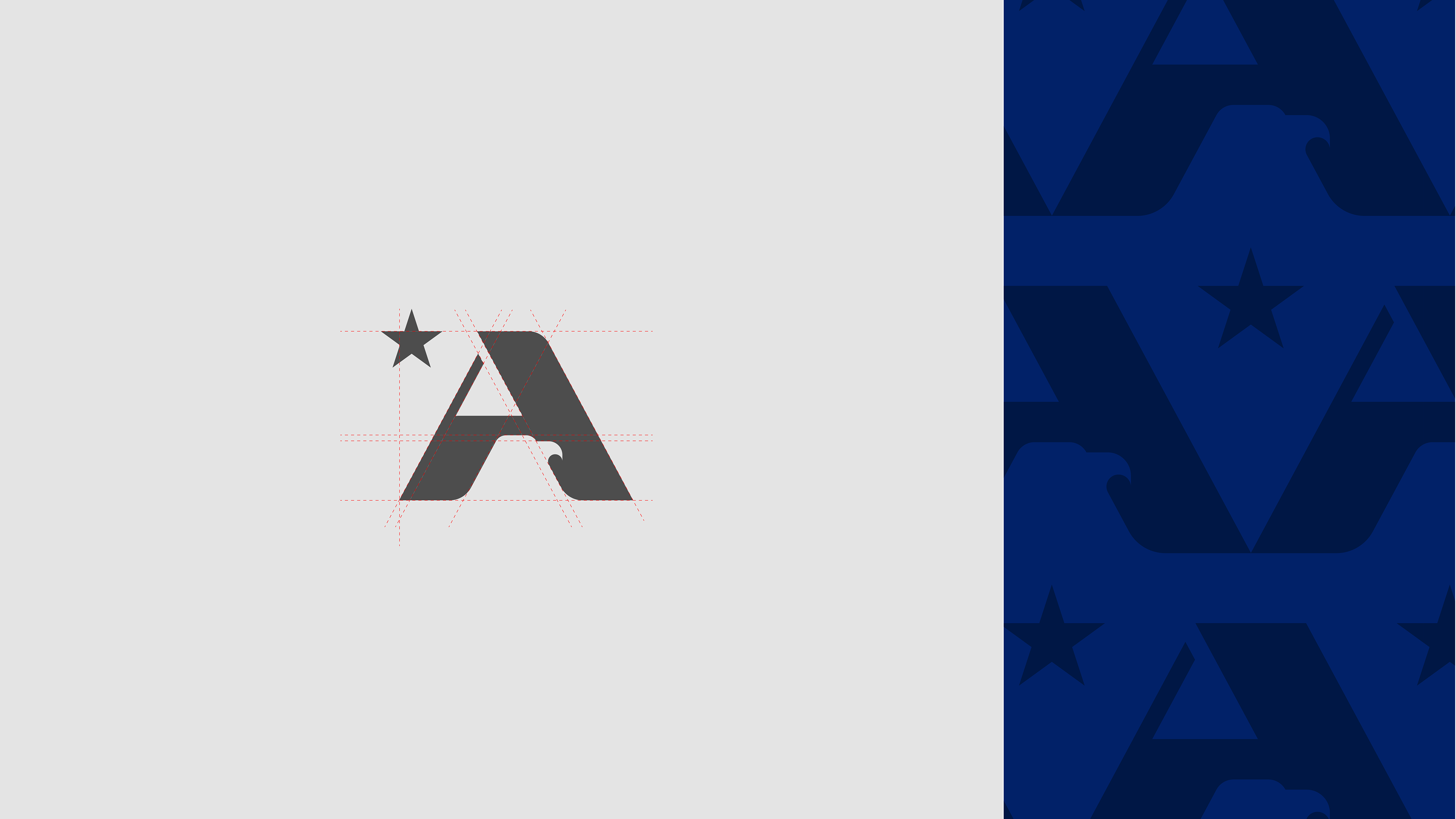
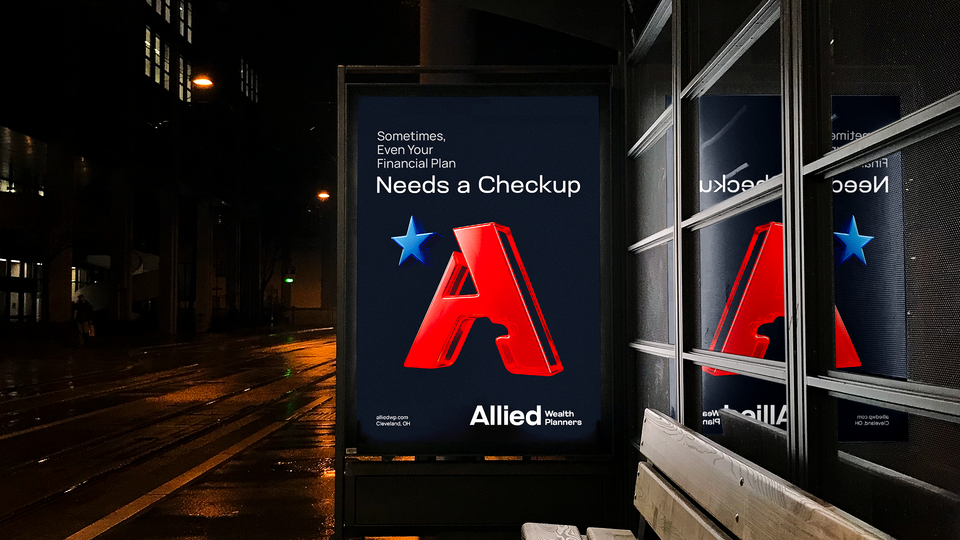
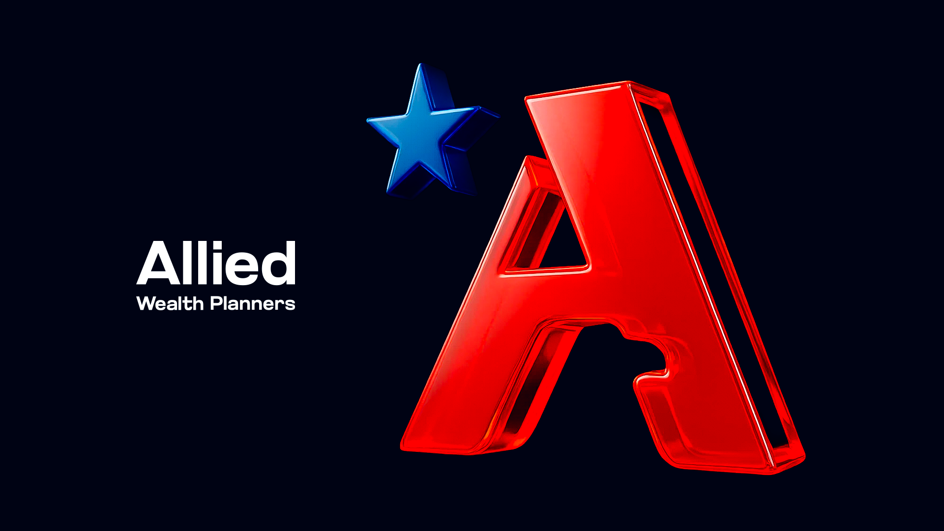
The client wanted something unmistakably American. We worked with red, white, and blue — approached with care rather than convention. The symbol was built from the letter "A" and shaped to evoke the silhouette of an eagle: an icon tied to freedom, protection, and the idea of someone genuinely looking out for what matters to you. It's bold, readable at any scale, and carries the right weight for a firm asking clients to trust them with their financial future.
The result is a brand that feels like AWP actually is — approachable, direct, and on your side.
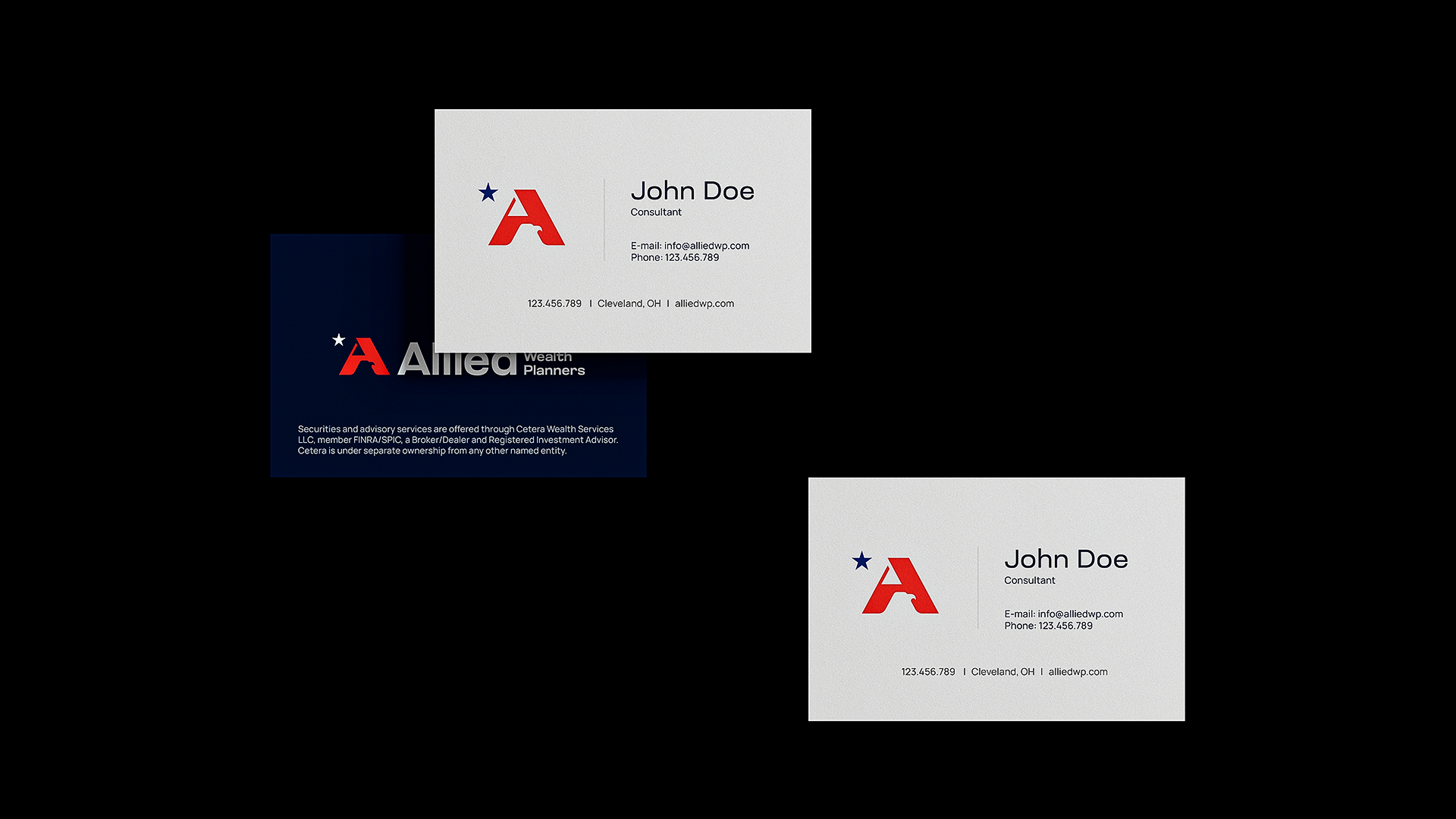


Client: Allied Wealth Planners · Agency: BrandDog · Cleveland, OH · 2025
Role: Brand Designer / Art Director