A Visual System Built to Work as Hard as the Product
Everight Position develops sensor technology for industrial automation — a category where precision and technical credibility are non-negotiable. After nearly five years of ongoing marketing support through HeyNow!, a full brand and website refresh was the natural next step.
The brief was to evolve the brand without losing its equity. Keep what was already recognized; rebuild everything that was holding it back.
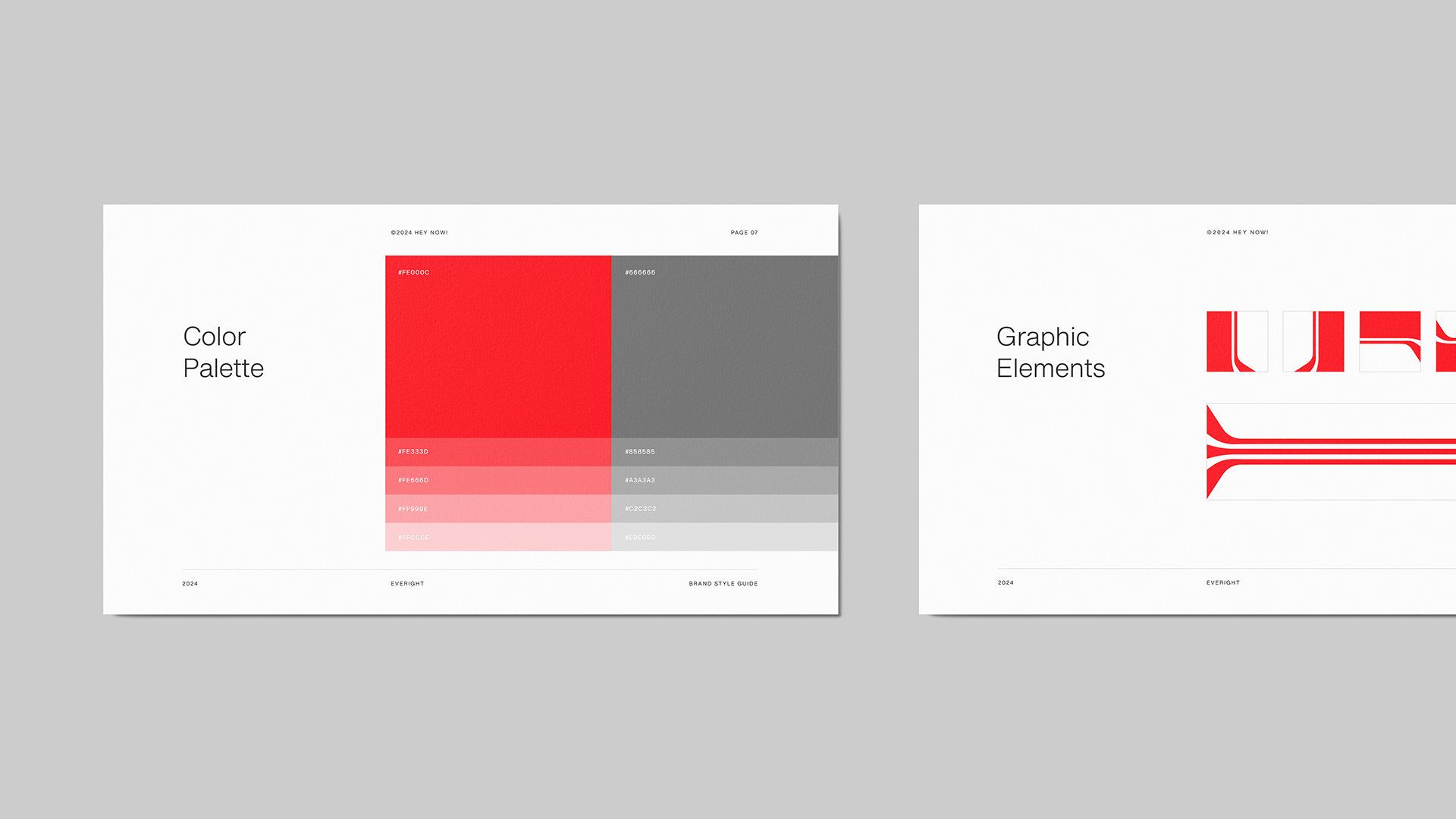
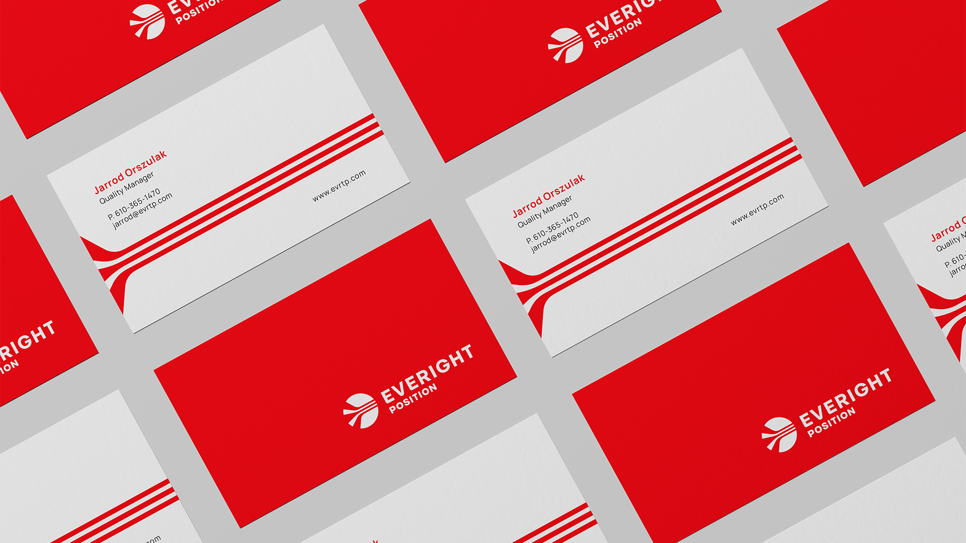
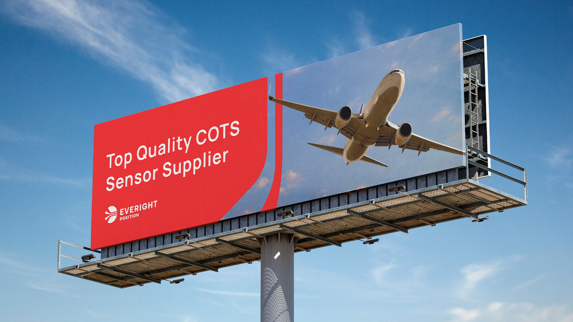
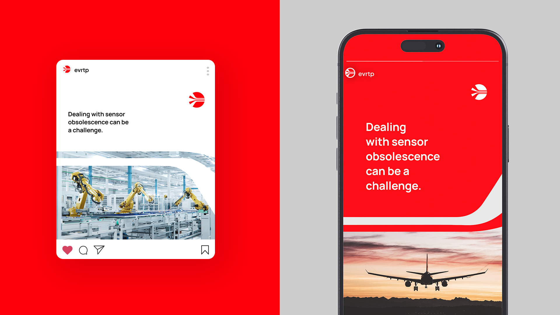
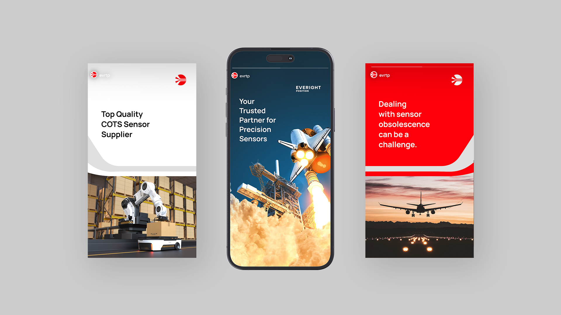
I led the visual identity as Art Director, covering logo redesign, symbol development, typography system, and brand applications across digital and physical contexts. The core brand color was retained as an anchor of continuity. Everything else was approached fresh.
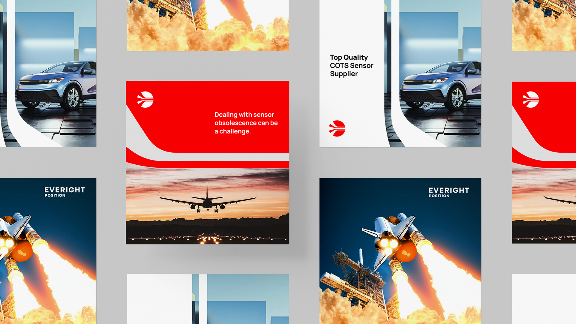
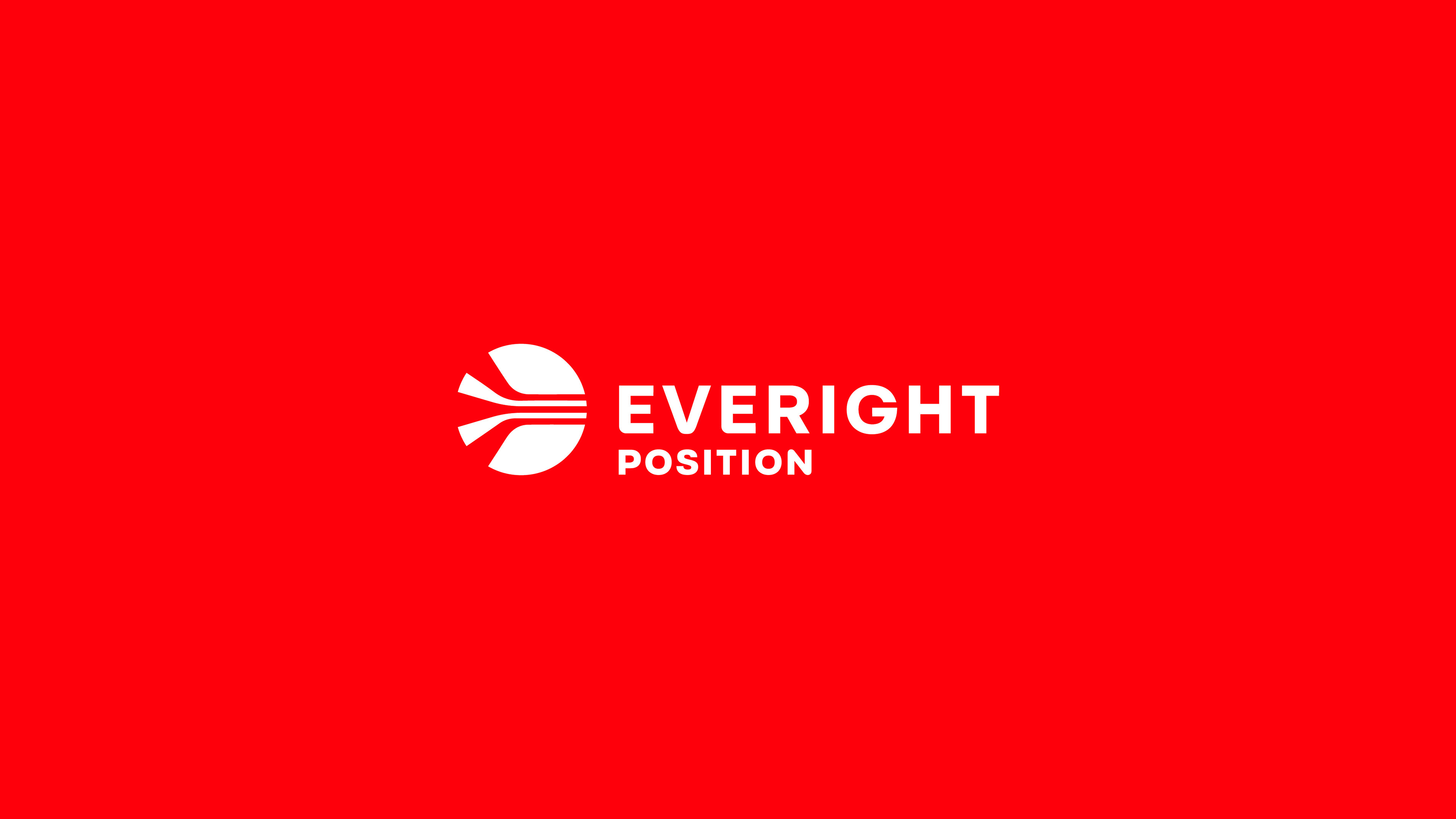
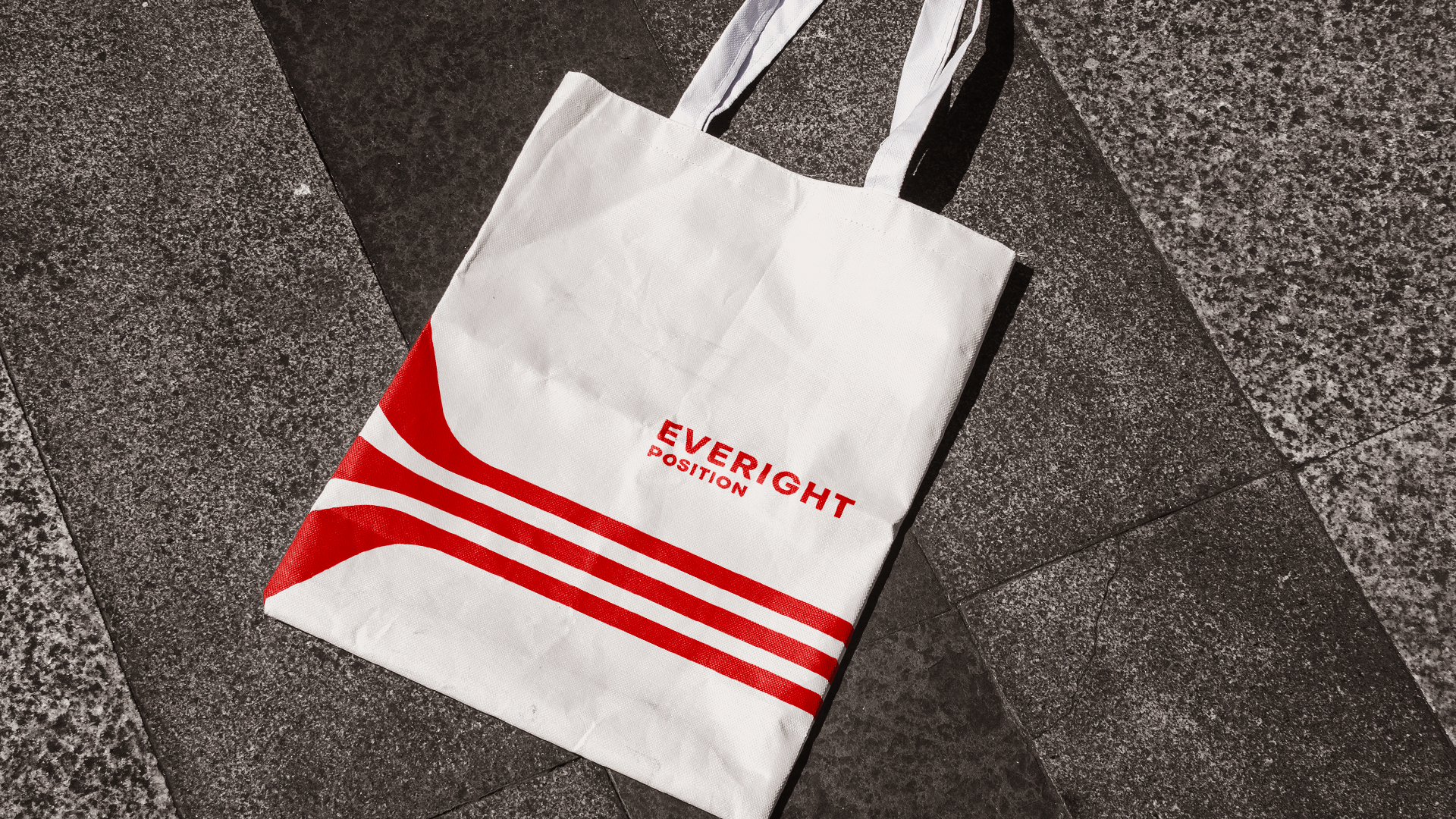
The symbol became the central creative challenge of the project. It needed to represent what Everight's sensors actually do: connect disparate components into a single, cohesive system. The result is a geometric mark that captures movement, automation, and connectivity — distinctive enough to generate a wide range of applications across print, digital, and physical environments without losing coherence.
An identity precise enough to match the product it represents.

Client: Everight Position · Agency: HeyNow Media · Cleveland, OH · 2024
Role: Art Director / Brand Designer