Repositioning a Brand That Had Outgrown Itself
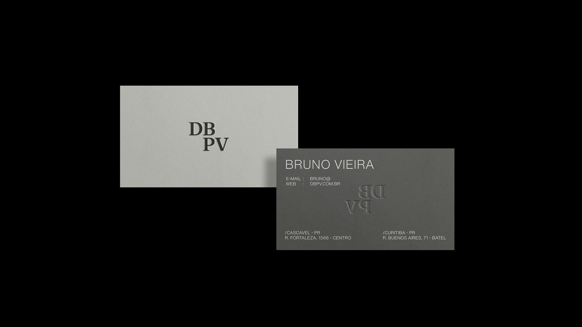
DBPV is a Brazilian marketing agency with a proprietary methodology built on three pillars: creativity, strategy, and relationships. After years of consistent growth, the brand had reached a new level in the market — and its identity needed to reflect that without losing what people already recognized.
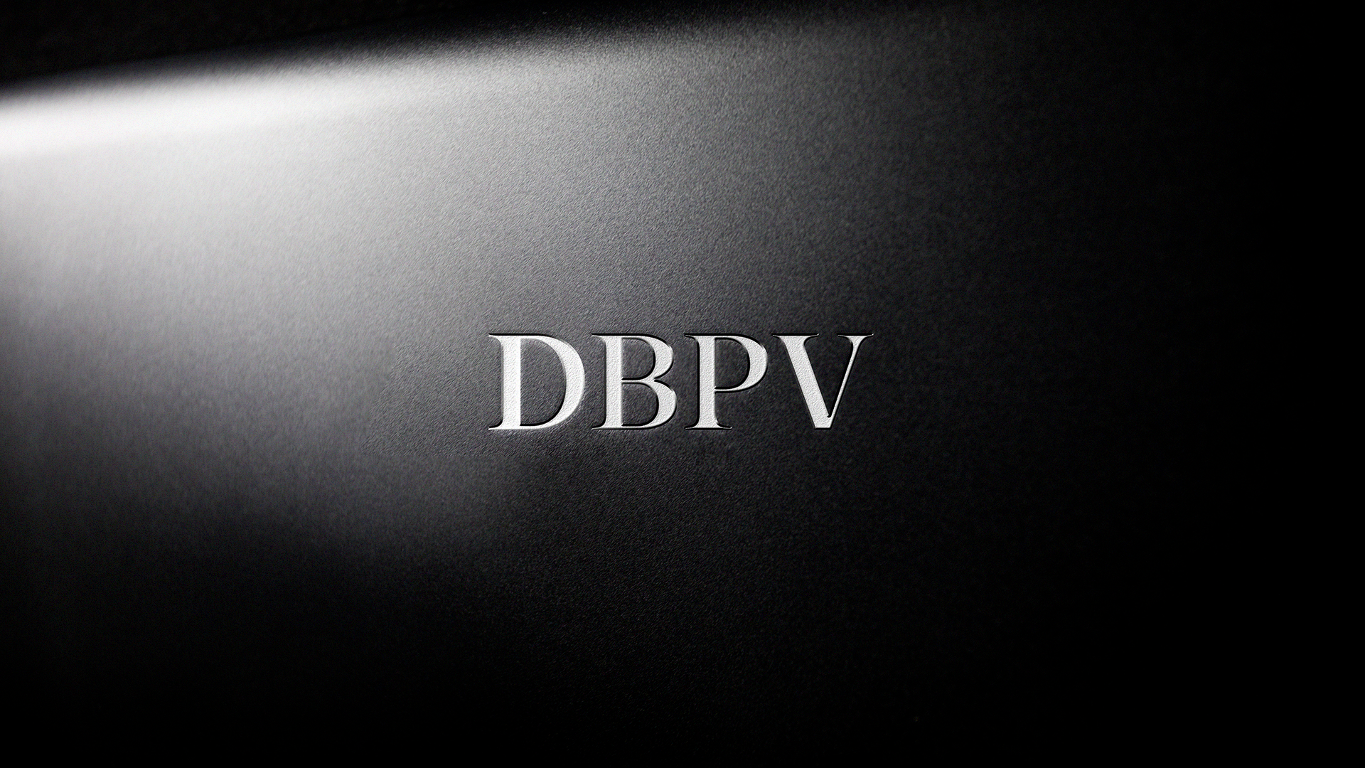
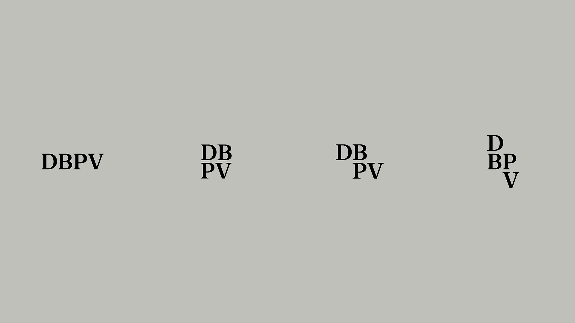
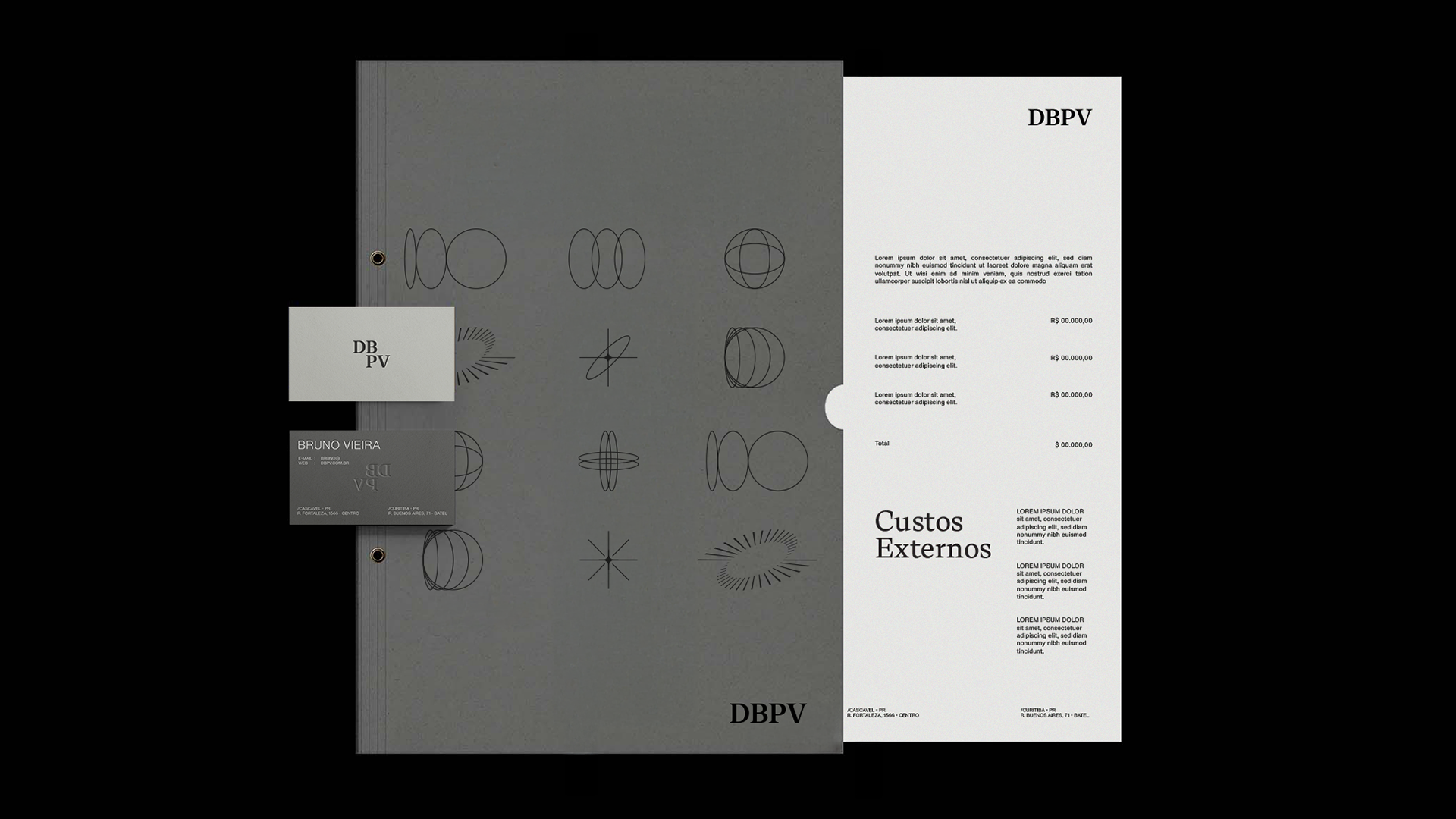
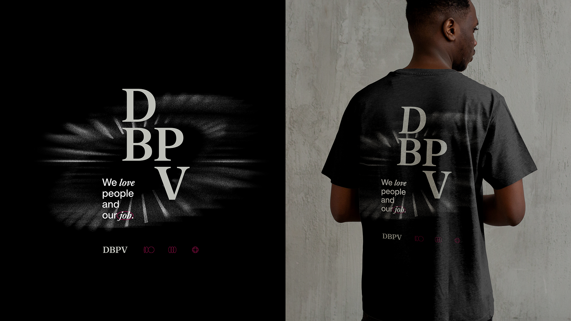
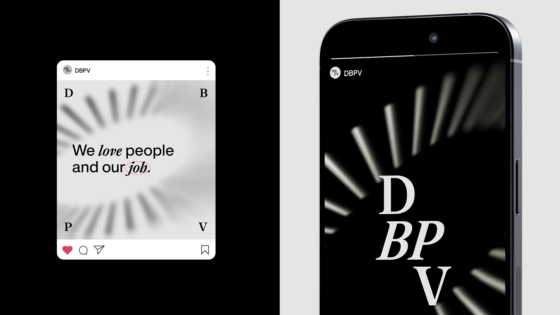
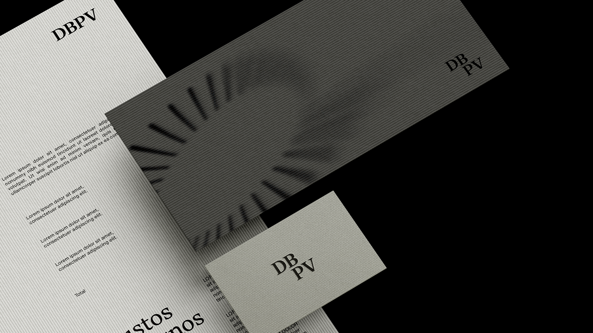
The challenge was knowing what to keep. The logo had real equity, so we started with refinement rather than reinvention. A typographic update brought more impact, legibility, and flexibility to the wordmark while preserving its recognition. From there, everything else was rebuilt around a new icon.
I led the project as Art Director, responsible for the full visual identity: logo refinement, icon design, typography system, and brand application framework.
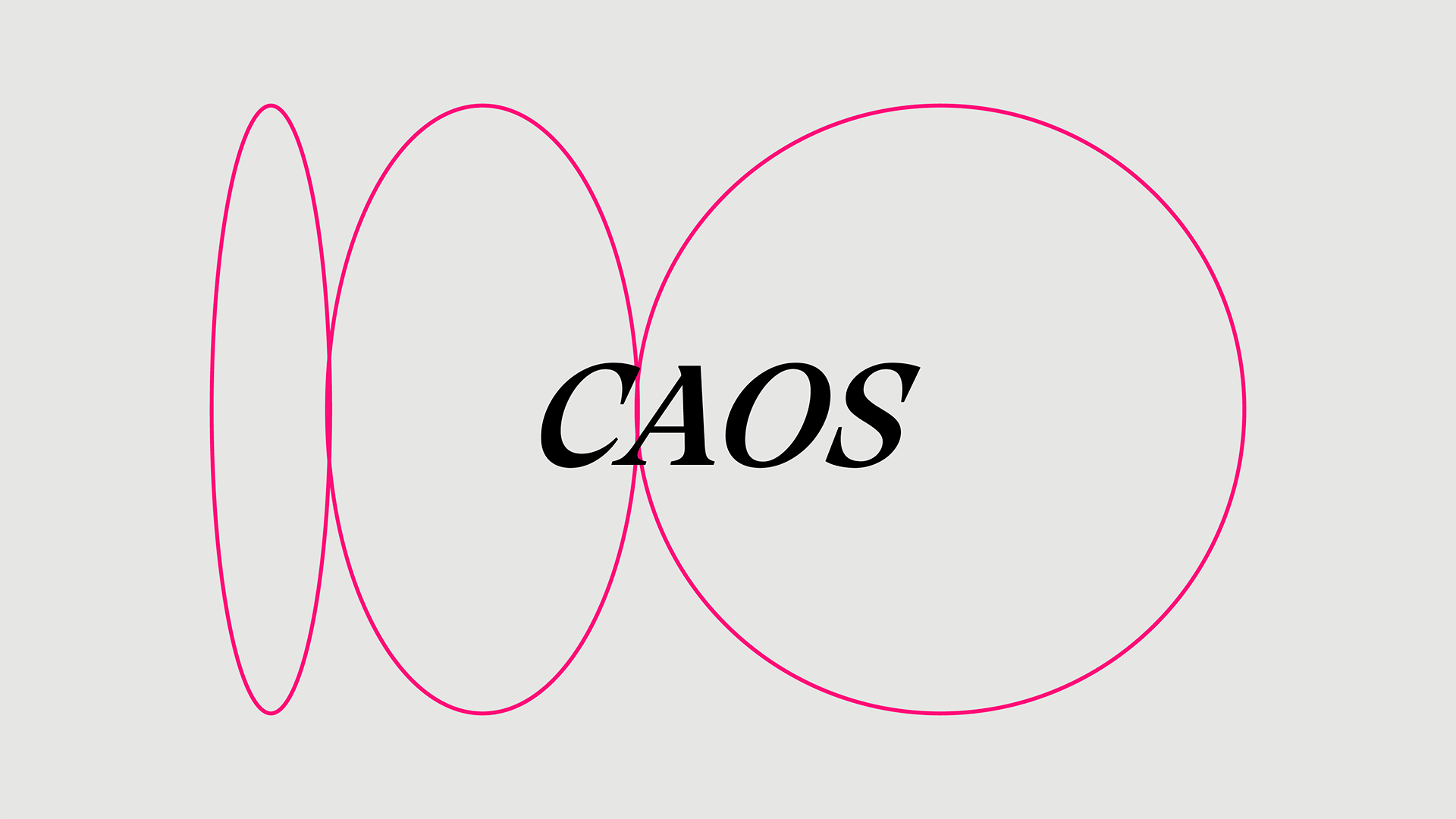
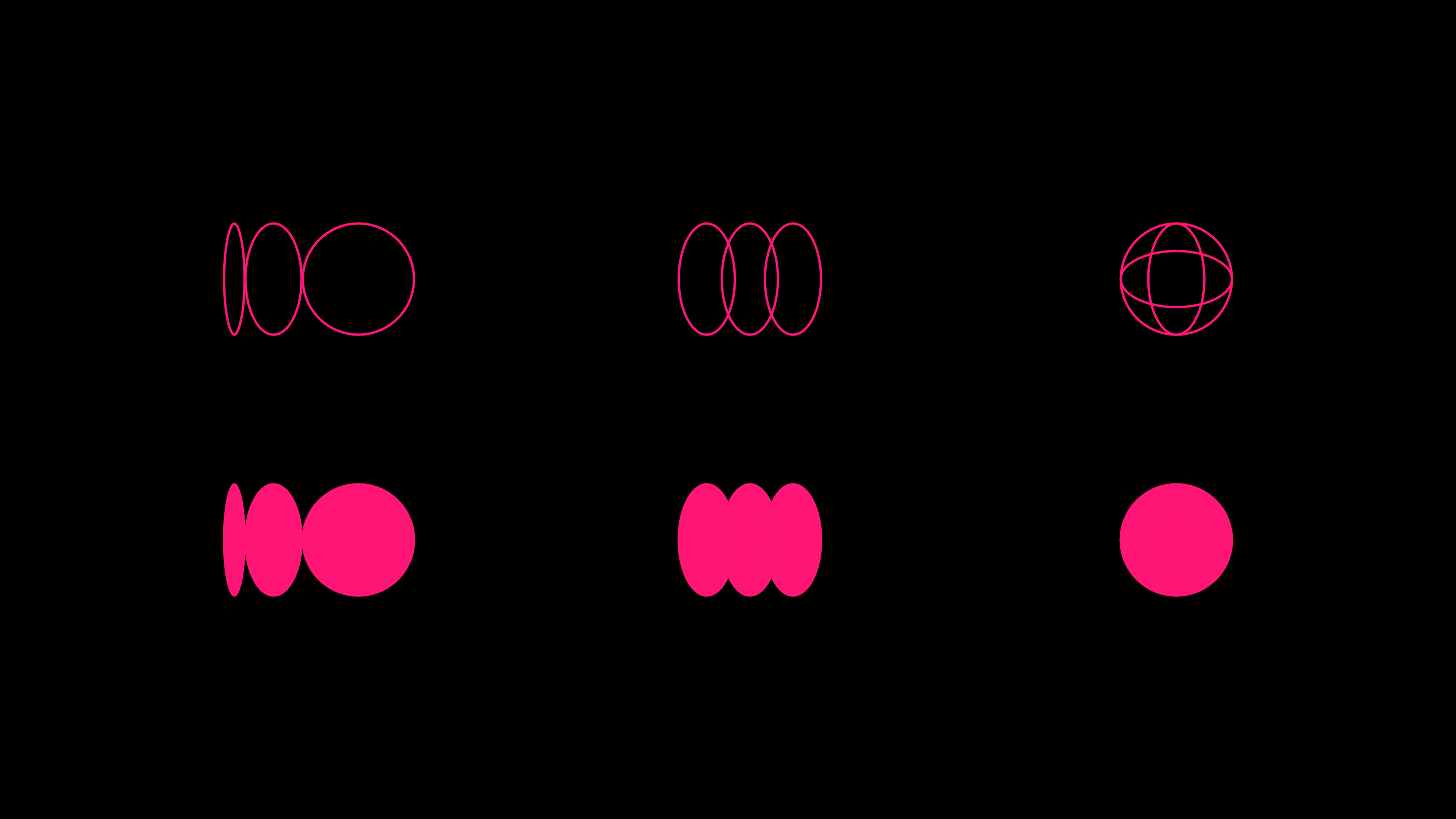
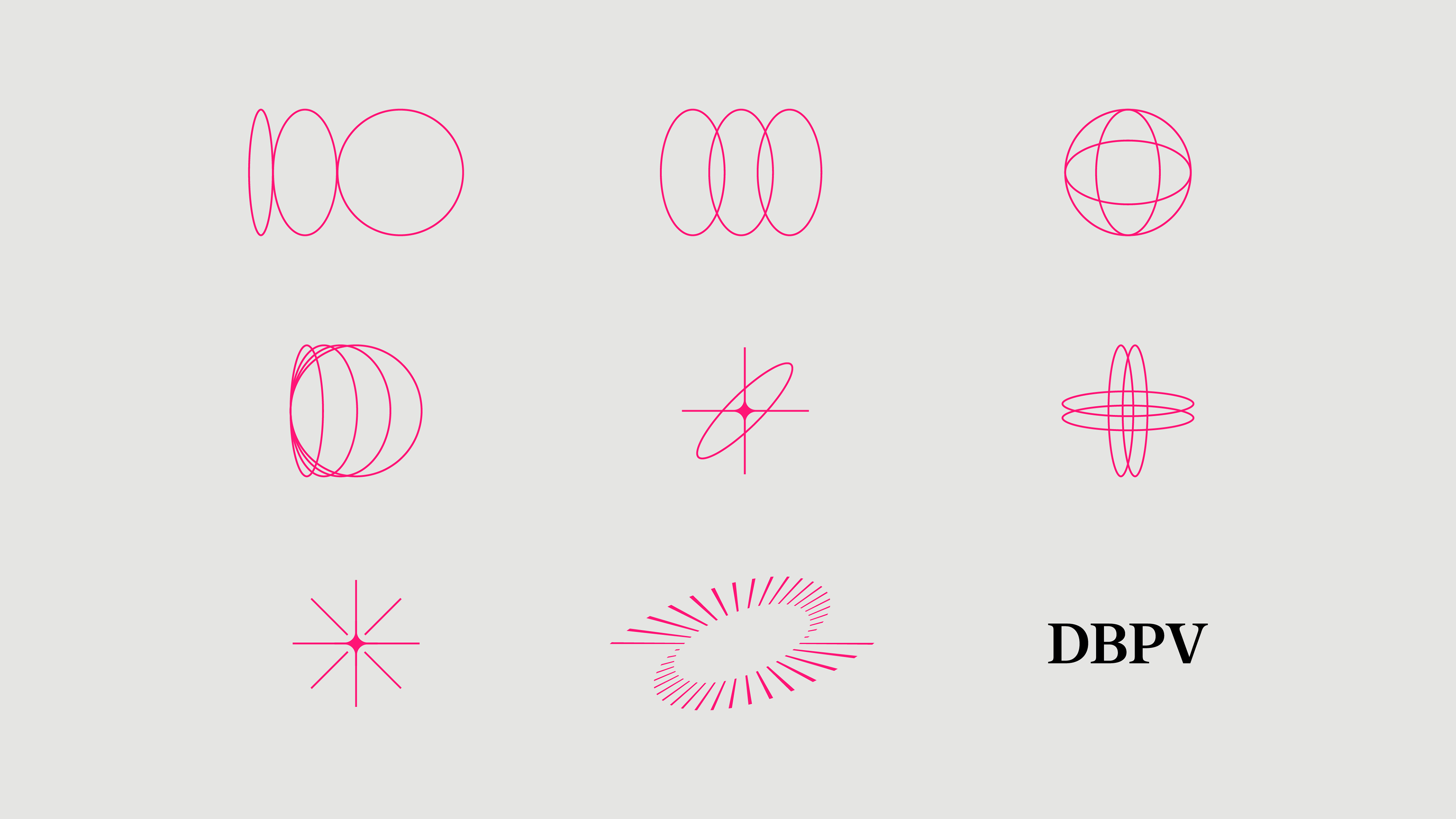
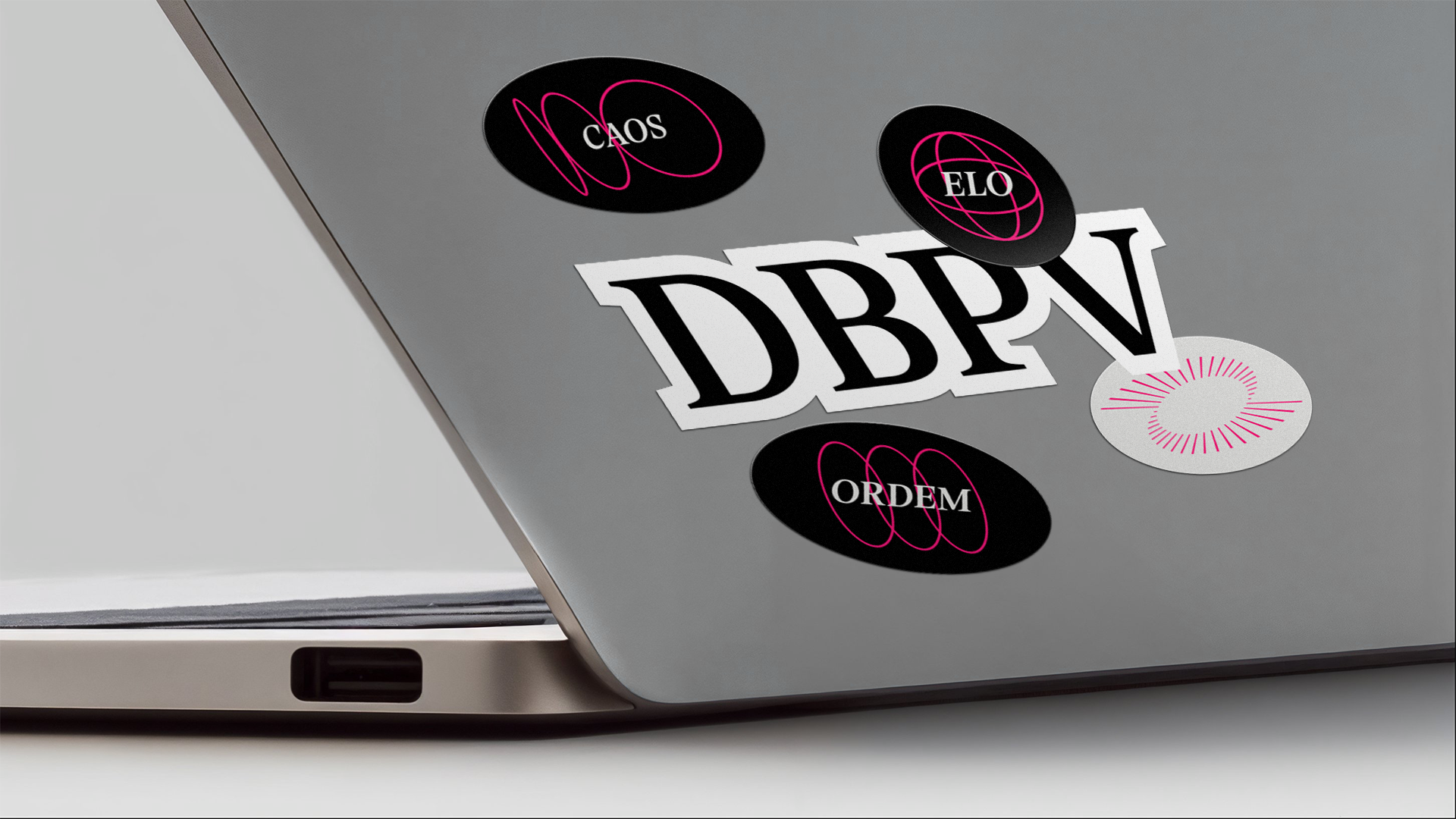
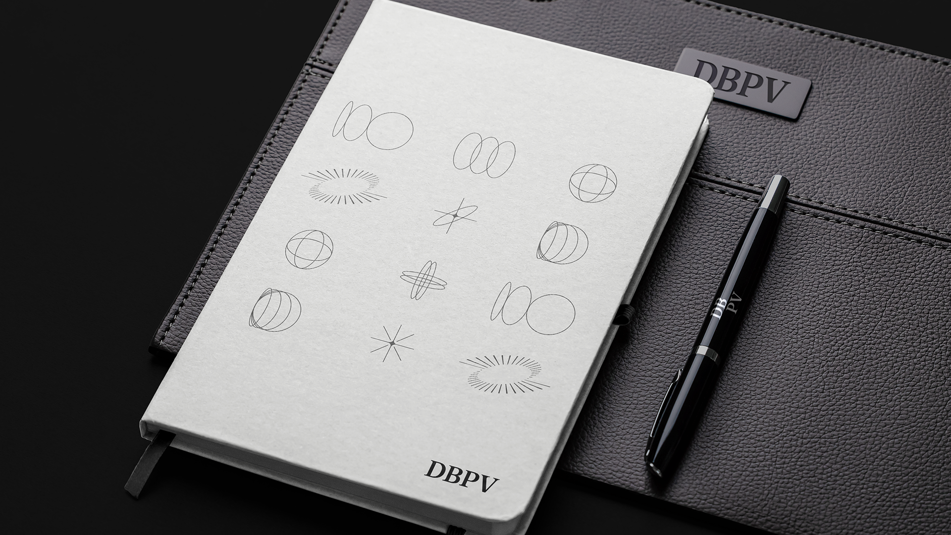
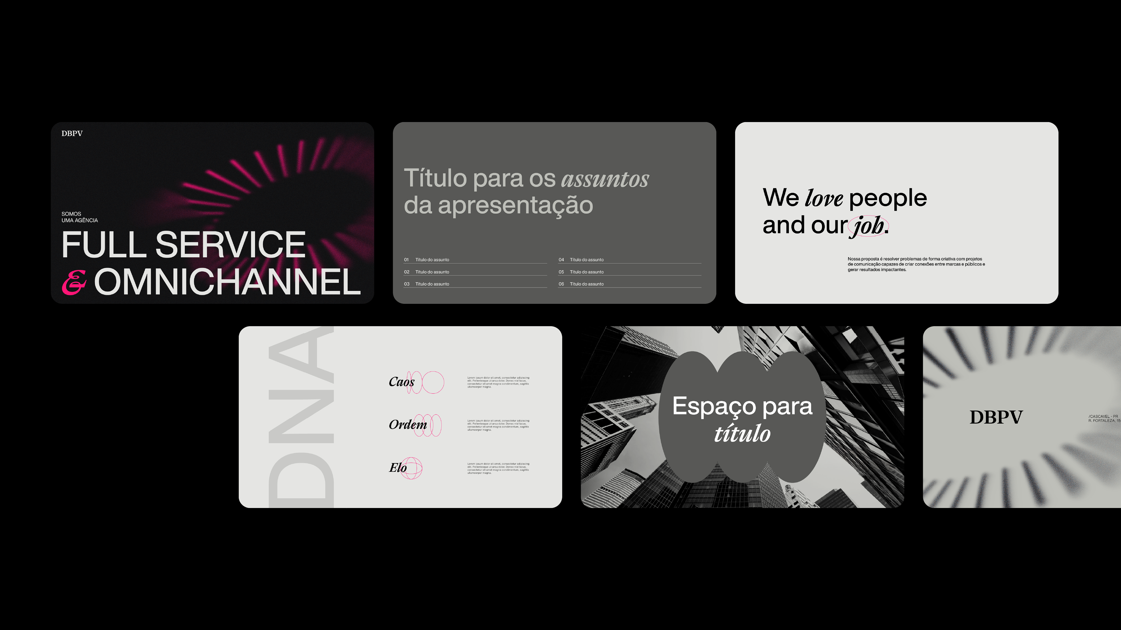
The icon is the core of the project — designed to represent DBPV's methodology and the essence of how they work. Three pillars, translated into circular forms:
- Creativity / Chaos — asymmetrical circles evoking the freedom of ideas
- Strategy / Order — perfectly aligned circles conveying structure and direction
- Relationships / Bond — interconnected circles representing the ties that sustain every project
- Strategy / Order — perfectly aligned circles conveying structure and direction
- Relationships / Bond — interconnected circles representing the ties that sustain every project
A secondary symbol set extends the system for brand communications — Diversity, Methodology, News, and Achievement — each with a clear visual logic that enriches the identity without fragmenting it.
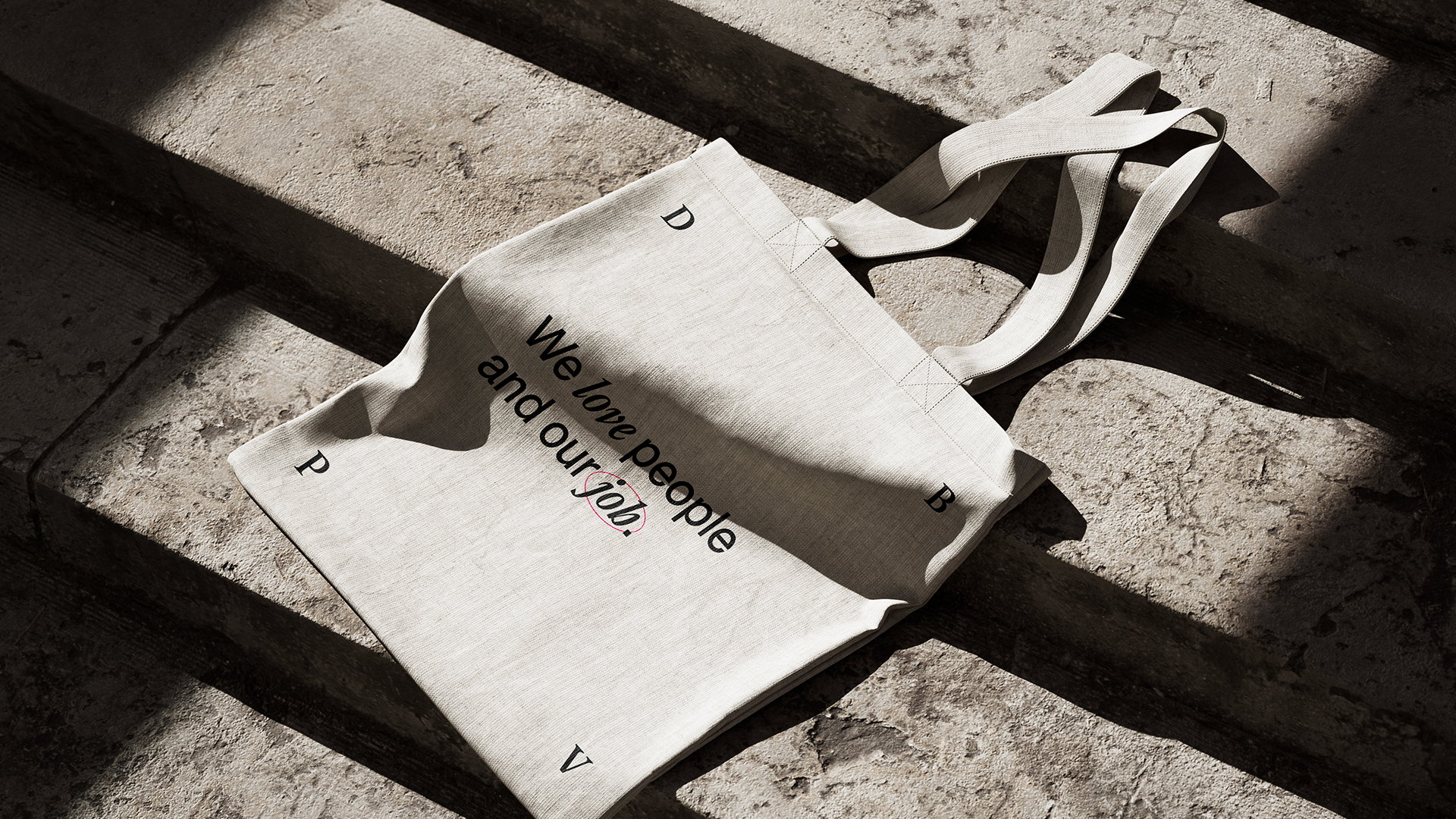
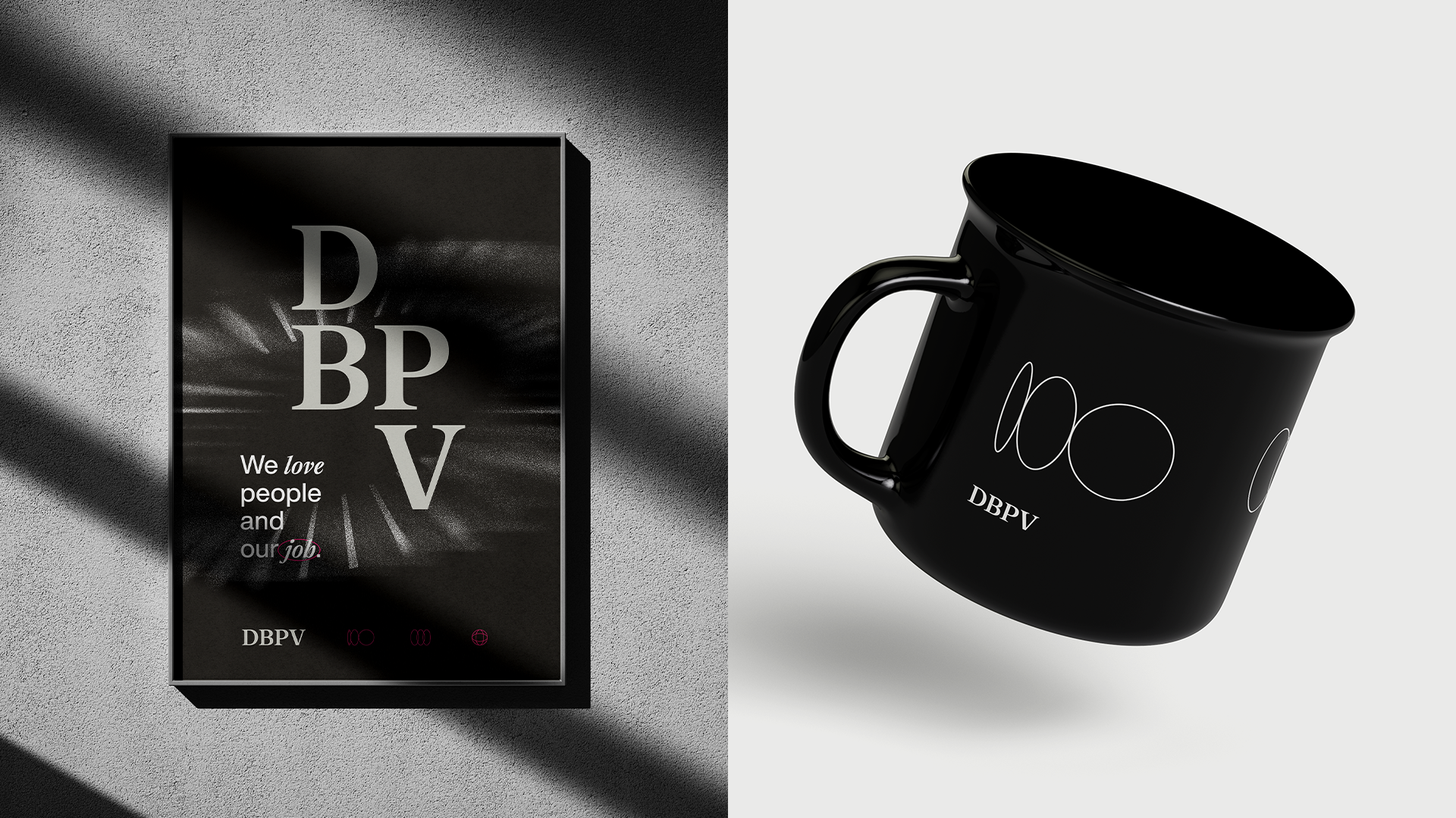
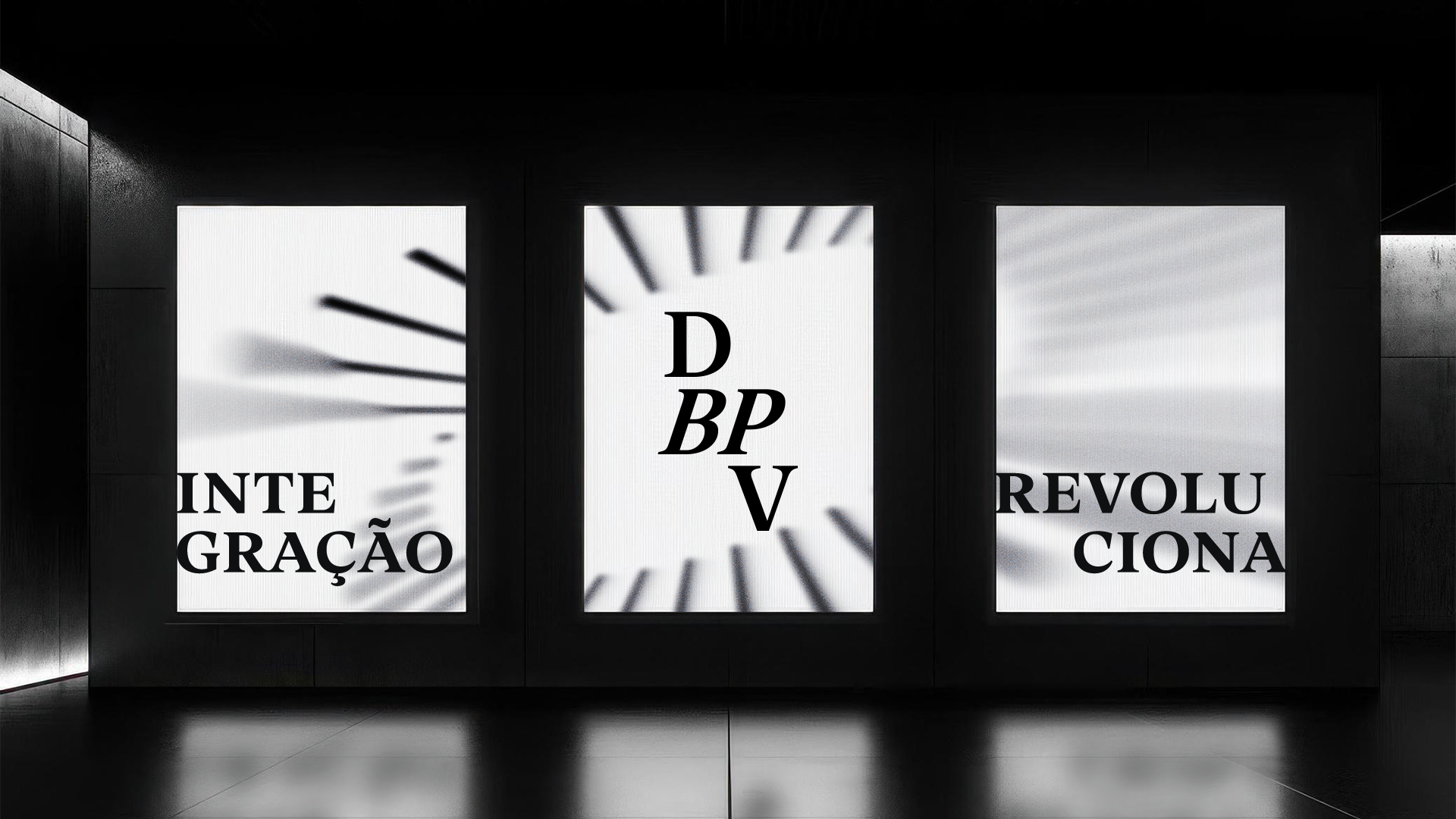
The result is a visual system that's both strategic and expressive: a genuine reflection of DBPV as a brand and a culture.


Client: DBPV · Agency: DBPV · Cascavel, PR · 2024
Role: Art Director / Brand Designer