A Construction Supply Brand Built for the Digital Shelf
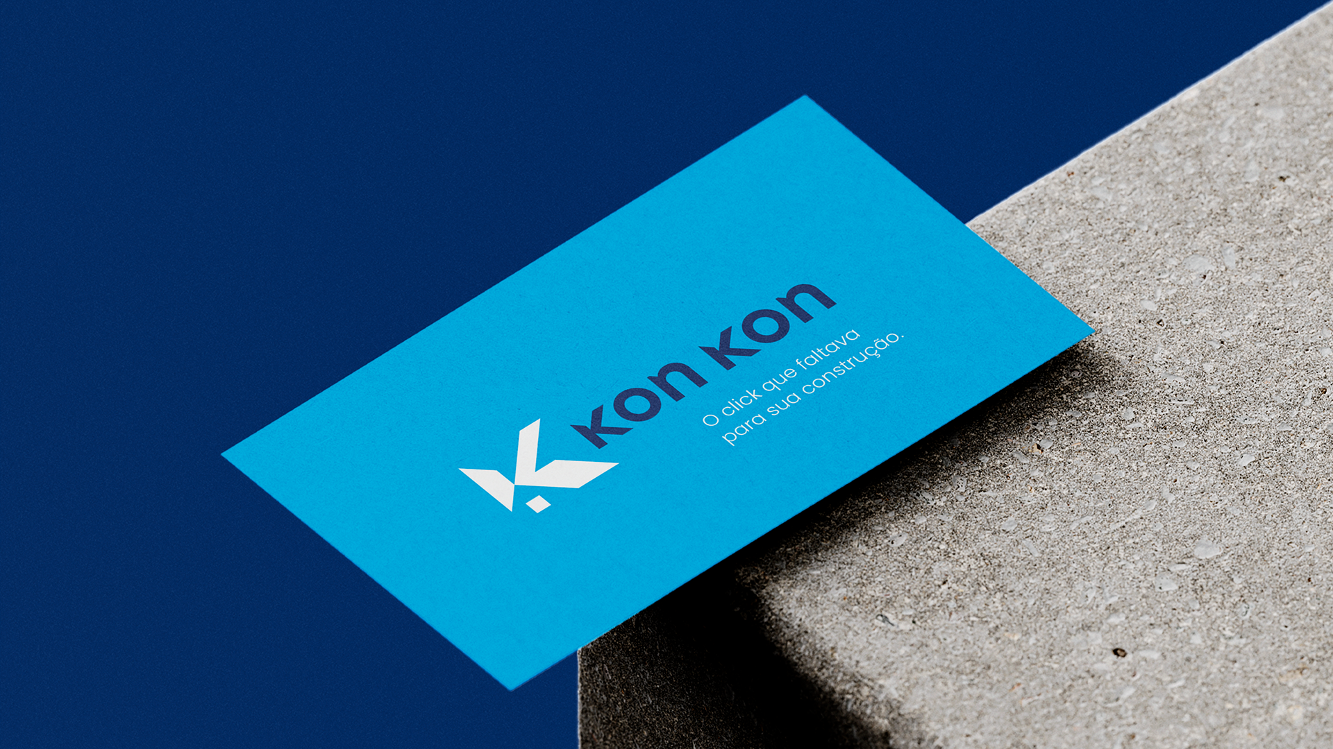
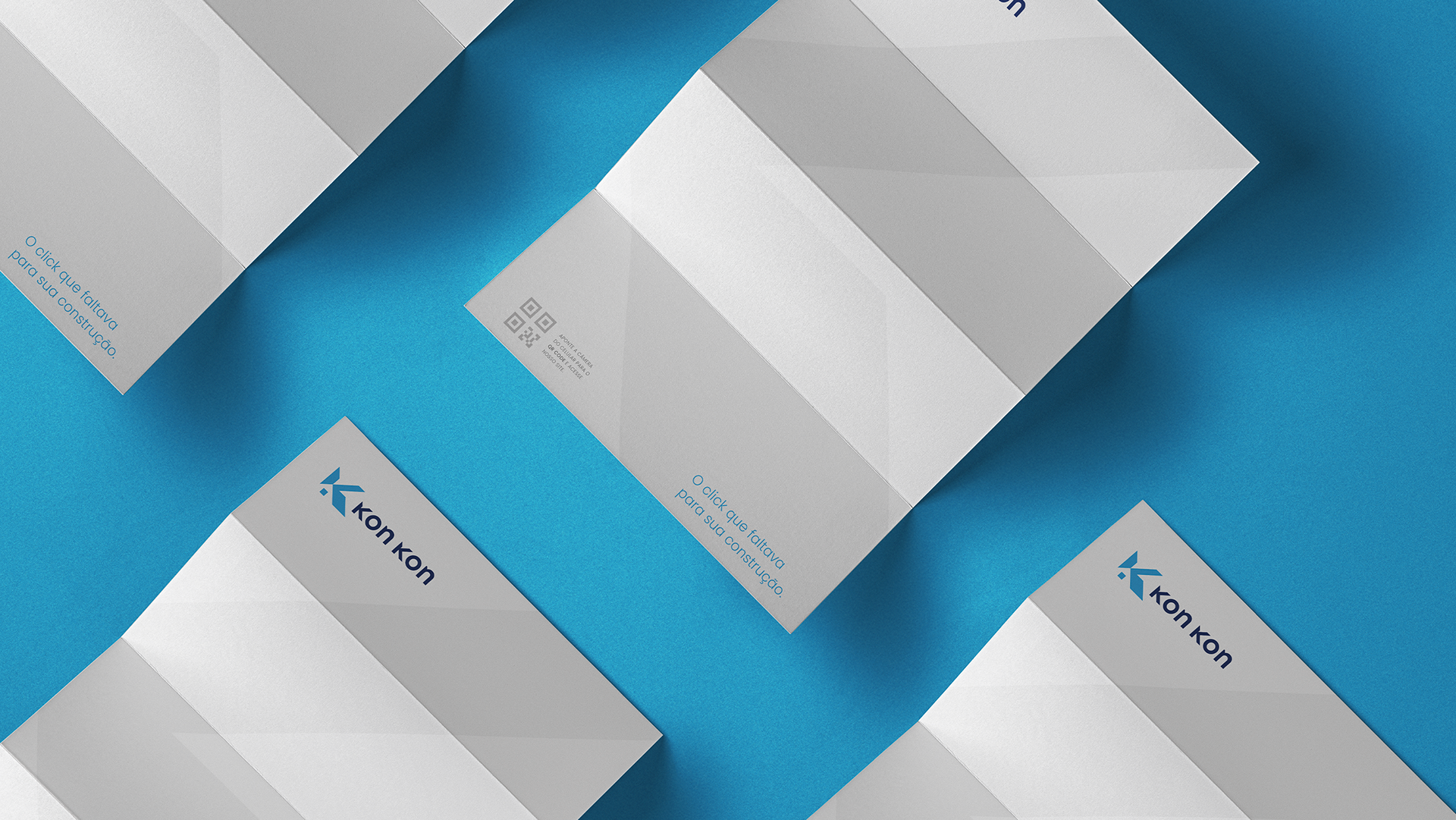
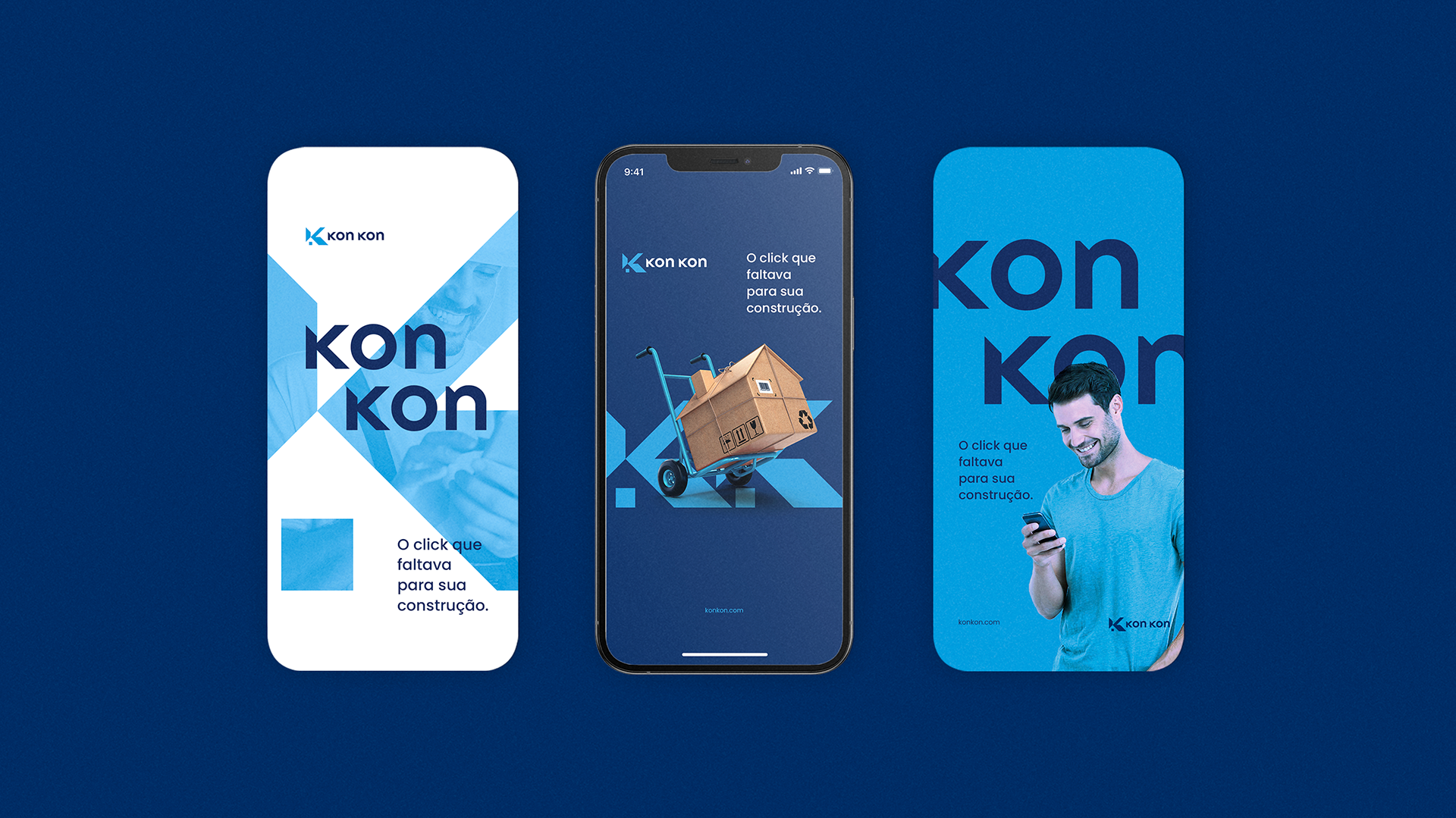
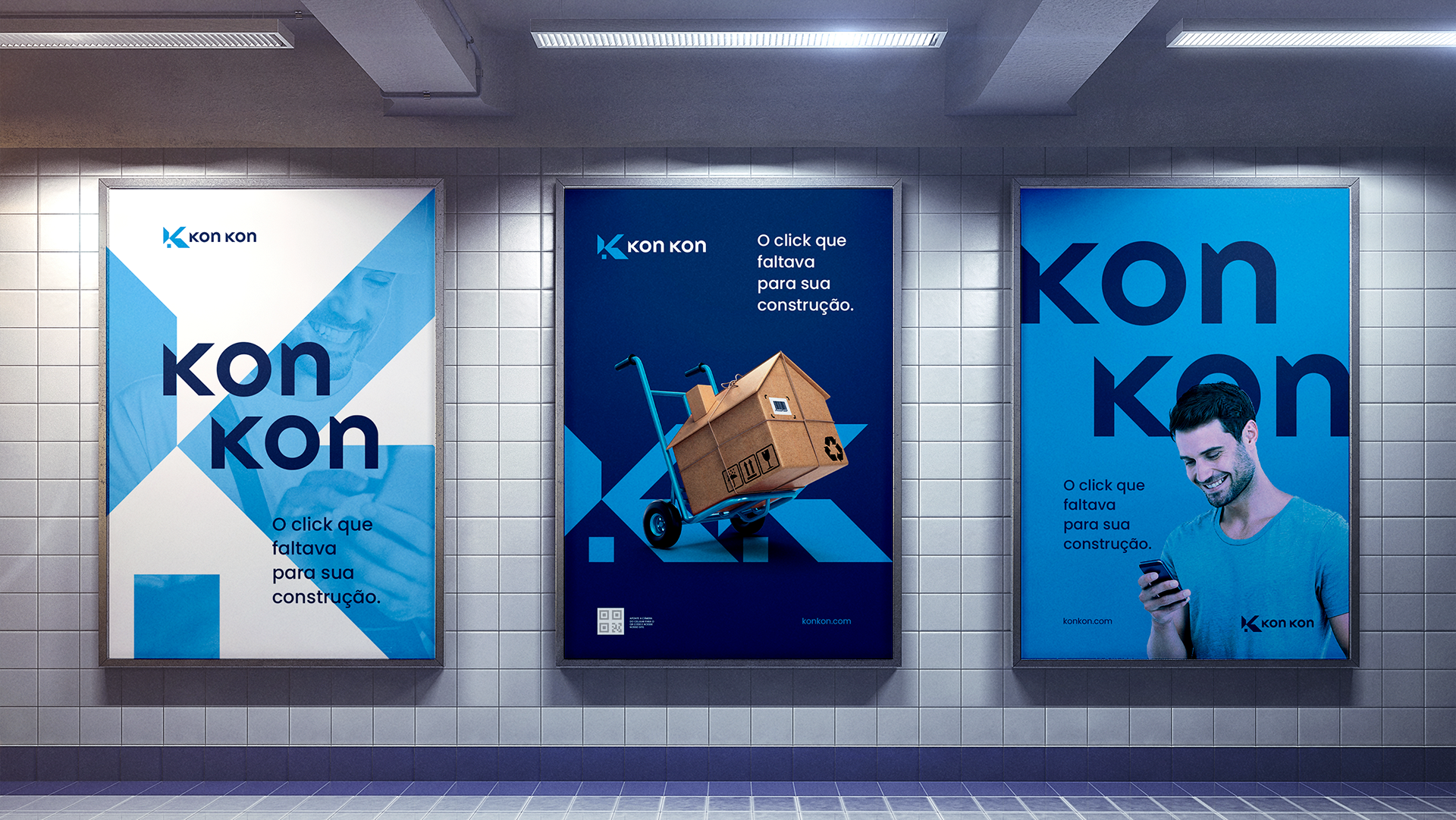
Kon Kon is an e-commerce platform selling construction materials — with a tagline that says exactly what it is: "The missing click for your construction." The brand needed to be direct, recognizable, and optimized for digital contexts where clarity is everything.
I led the brand identity as Brand Designer at Enjoy, responsible for the full visual concept and execution.
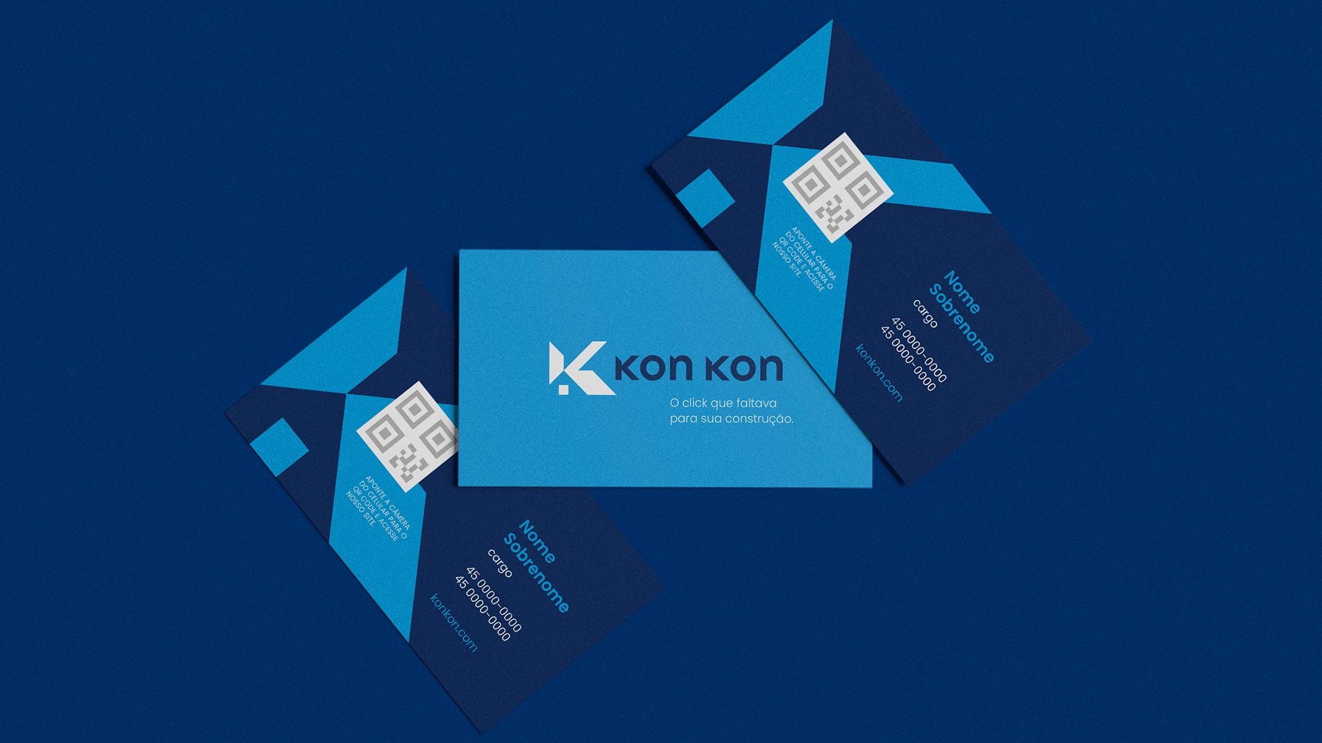
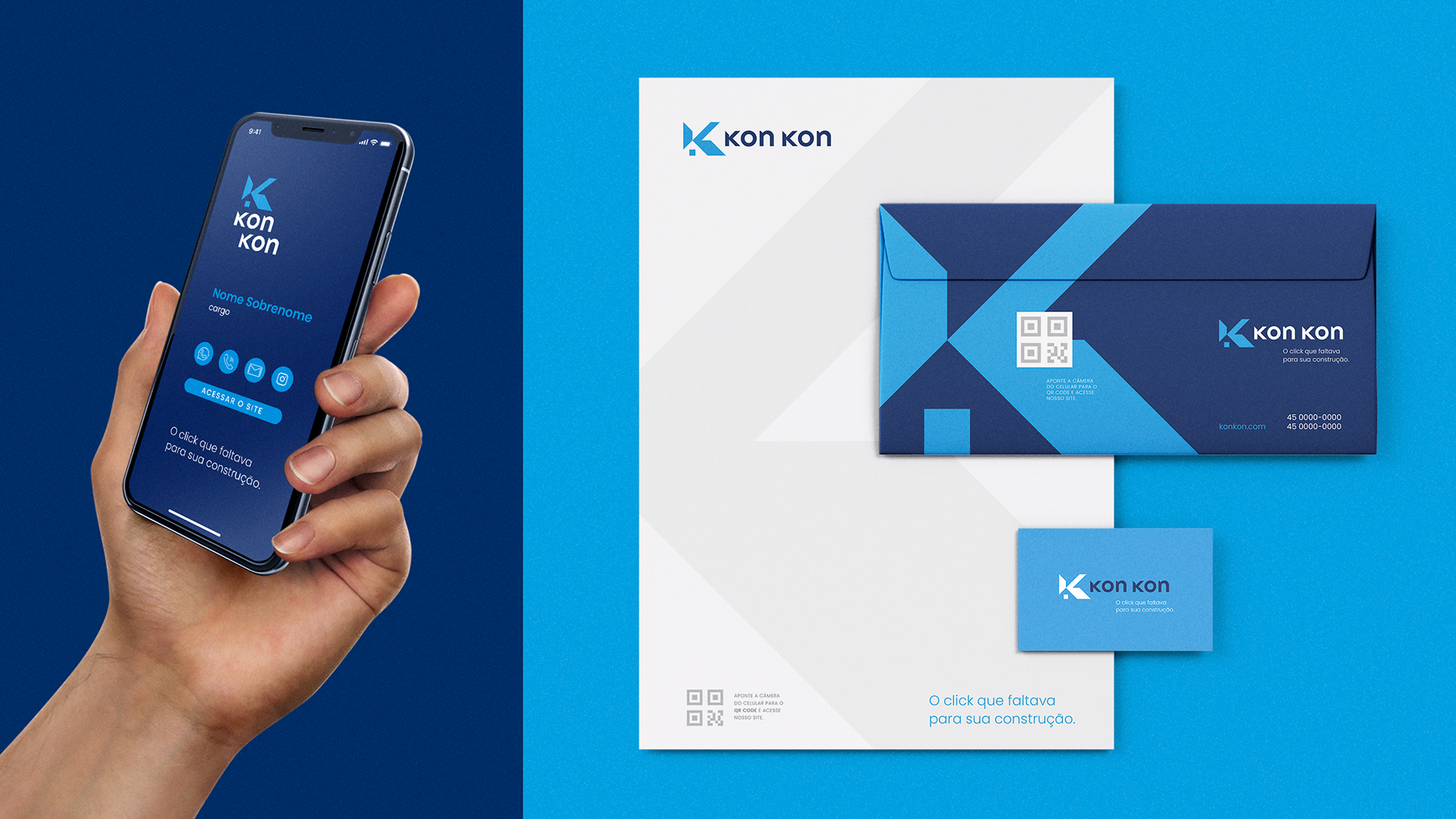
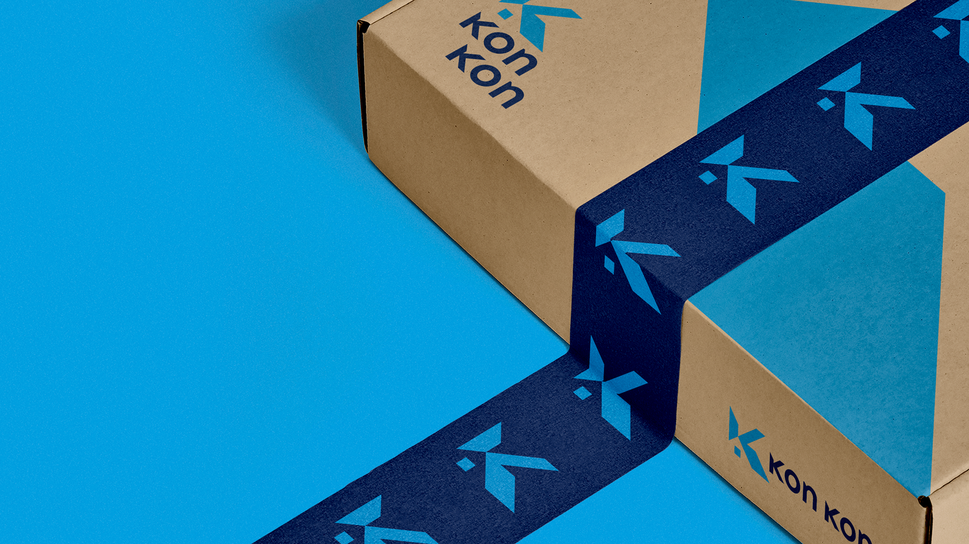
The logo was built around a dual concept: the letter K from the brand name, combined with the form of a house — a direct visual reference to construction. The result is a mark that communicates category immediately while maintaining enough distinctiveness to own the space. Clean, functional, and built to work at any scale across digital and physical applications.


Client: Kon Kon · Agency: Enjoy · Cascavel, BR · 2021
Role: Art Director / Brand Designer