A Campaign Where Typography Does the Work
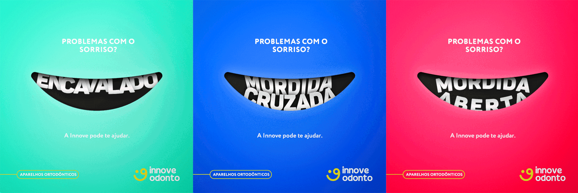
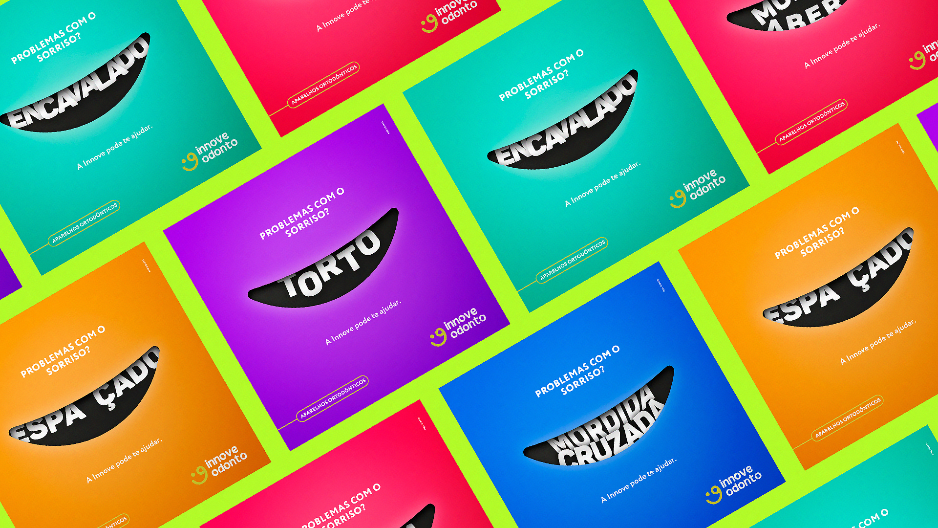
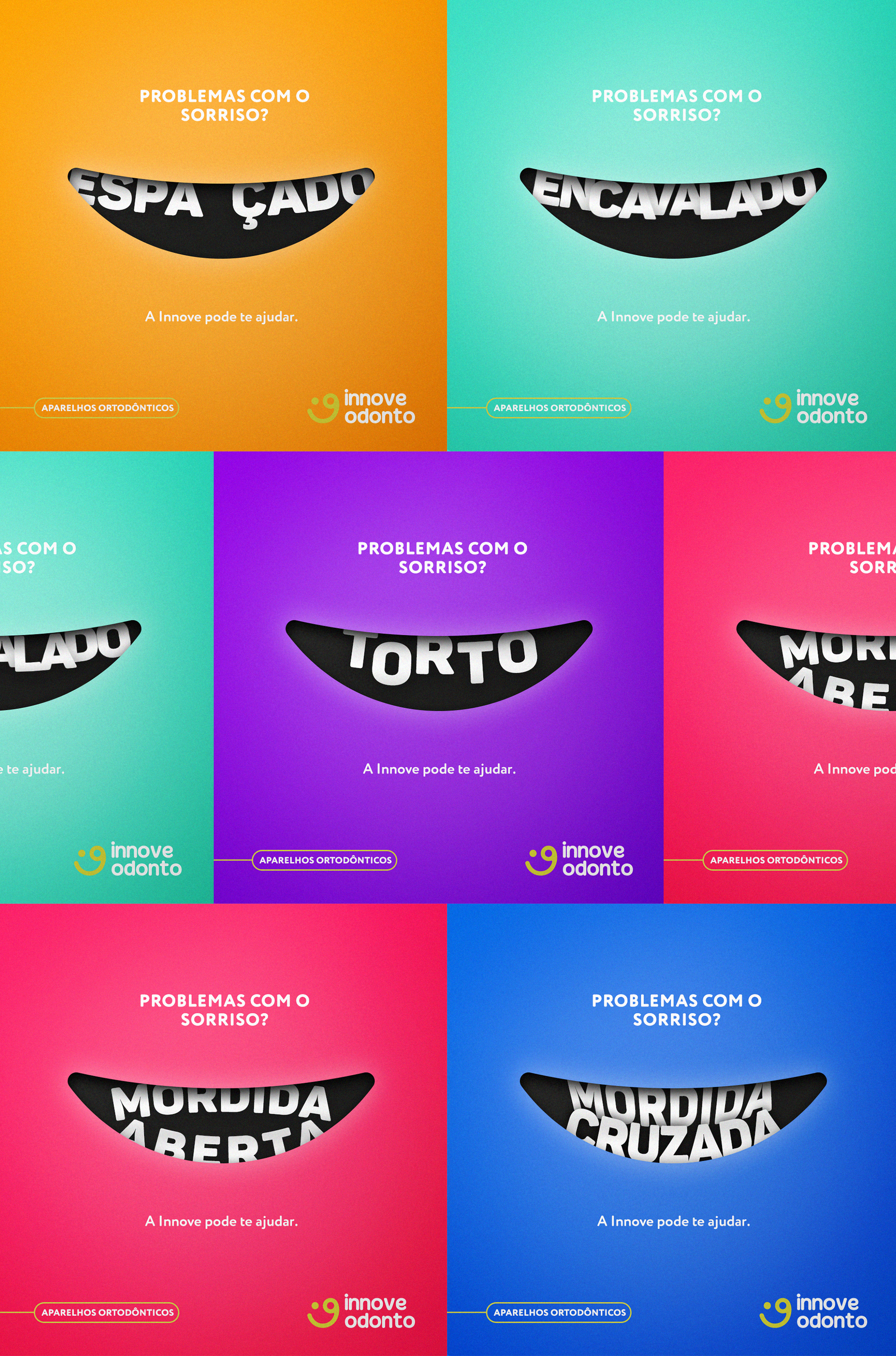
Innove Odonto is an orthodontic clinic. The brief for this social media campaign was to communicate the clinic's services in a way that felt light, engaging, and distinctly different from the typical clinical aesthetic of the category.
I served as Art Director at Roda Gigante on this project, working with copywriter Paulo Henrique and Creative Director André Ribeiro. The concept was built entirely around an all-type approach — using letterforms as the primary visual element rather than product imagery or lifestyle photography.
The execution draws a deliberate parallel: the typographic compositions reference the same misalignment and gradual correction that orthodontic treatment addresses. The letters, like teeth, start out of place — and resolve. It's a concept that's both visually clear and specific to the client's work, which is exactly what a well-executed campaign should be.
Client: Innove Odonto · Agency: Roda Gigante · July 2018
Role: Art Director · Copywriter: Paulo Henrique · Creative Director: André Ribeiro