Making the Strongest Choice Look Like the Obvious One
Zeus Power Supply operates in a high-stakes B2B space — electrical infrastructure, global supply chains, procurement teams who need confidence before they commit. The brief was direct: position Zeus as the most credible, reliable option in the category.
I led the visual identity work as Art Director through HeyNow!, from concept through final delivery.
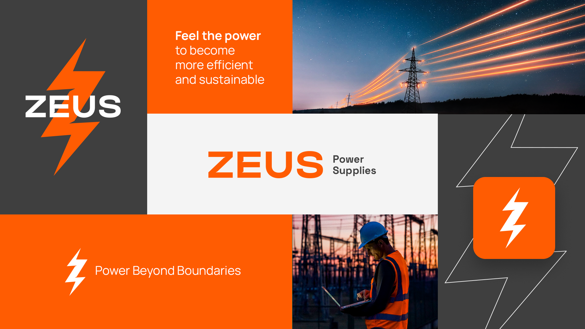
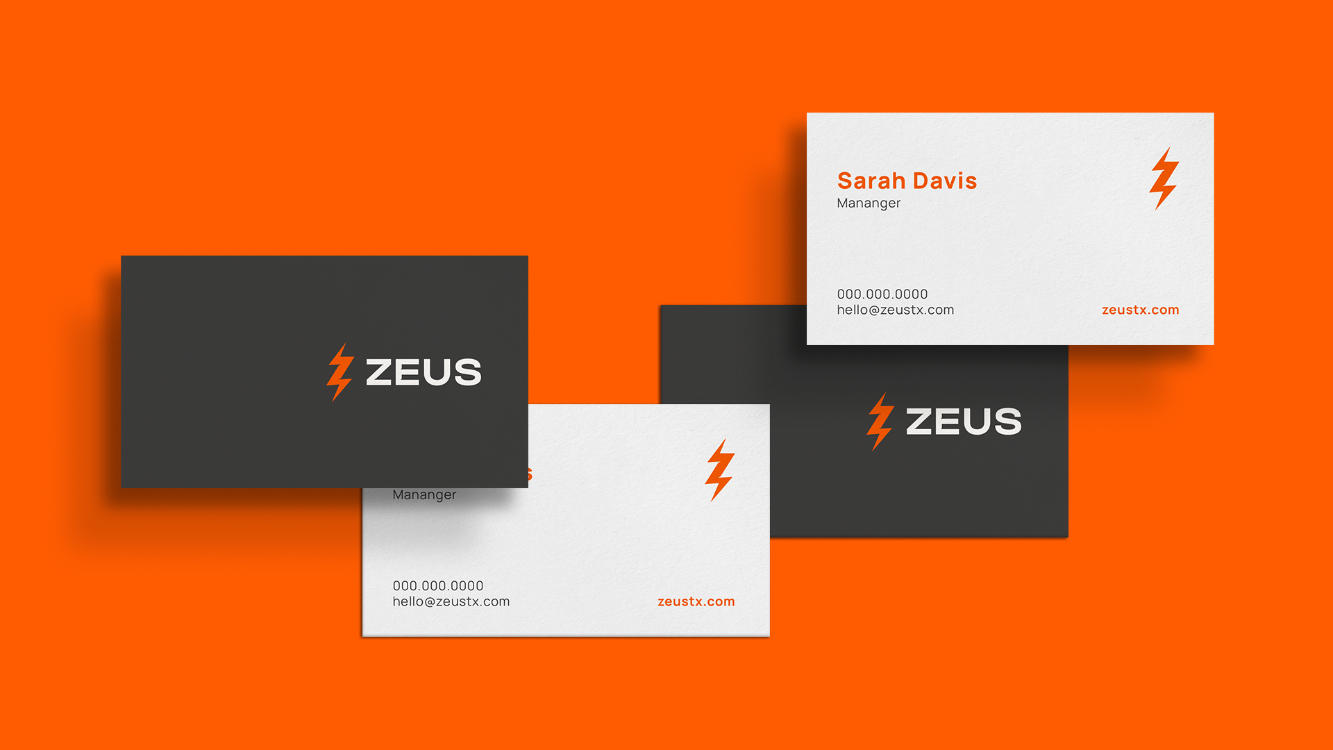
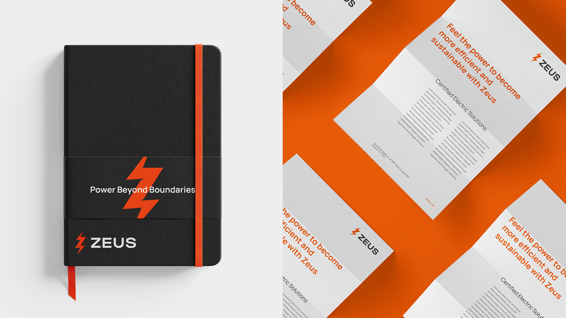
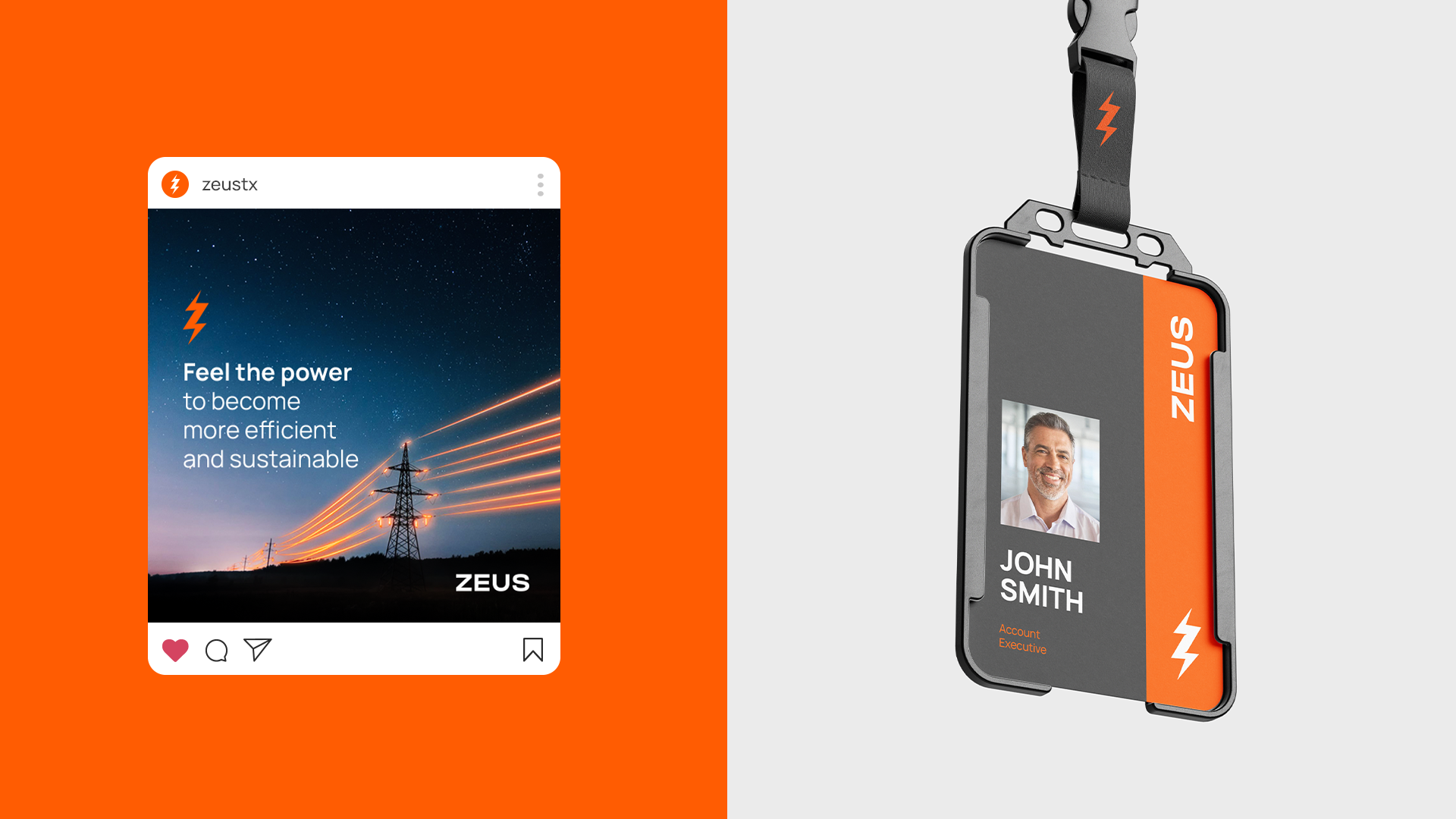
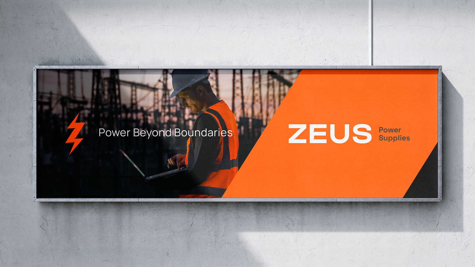
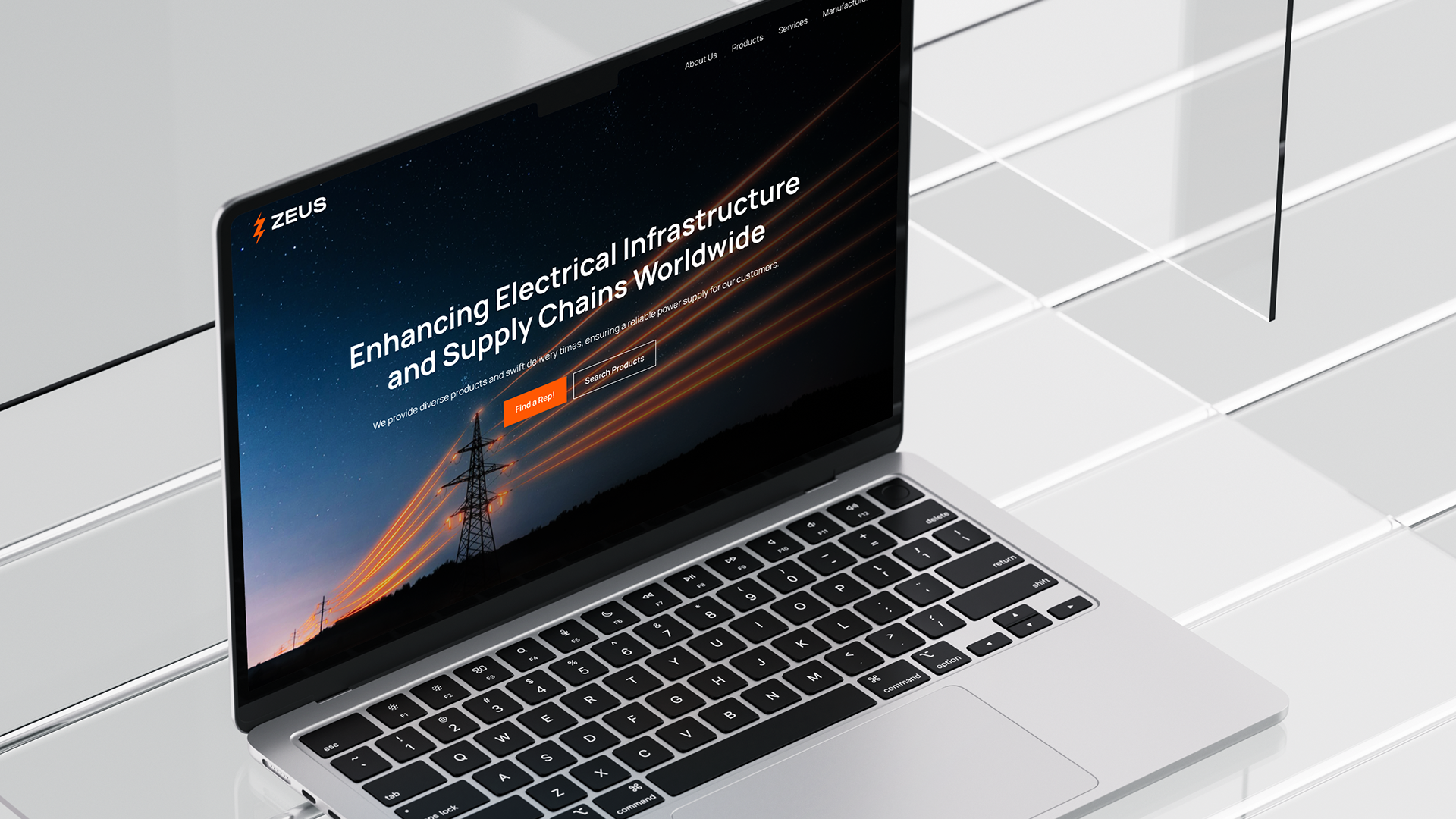
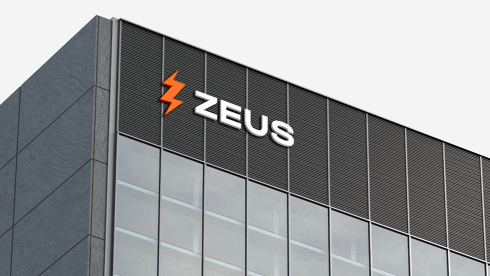
The existing brand had equity worth keeping, so we focused on refinement over reinvention. The color palette was retained and sharpened. A new typeface was selected with intention — modern and industrial, while also communicating the reliability you want in a long-term supplier. Custom letterforms in the Z and E of the wordmark brought more presence and distinctiveness to the mark.
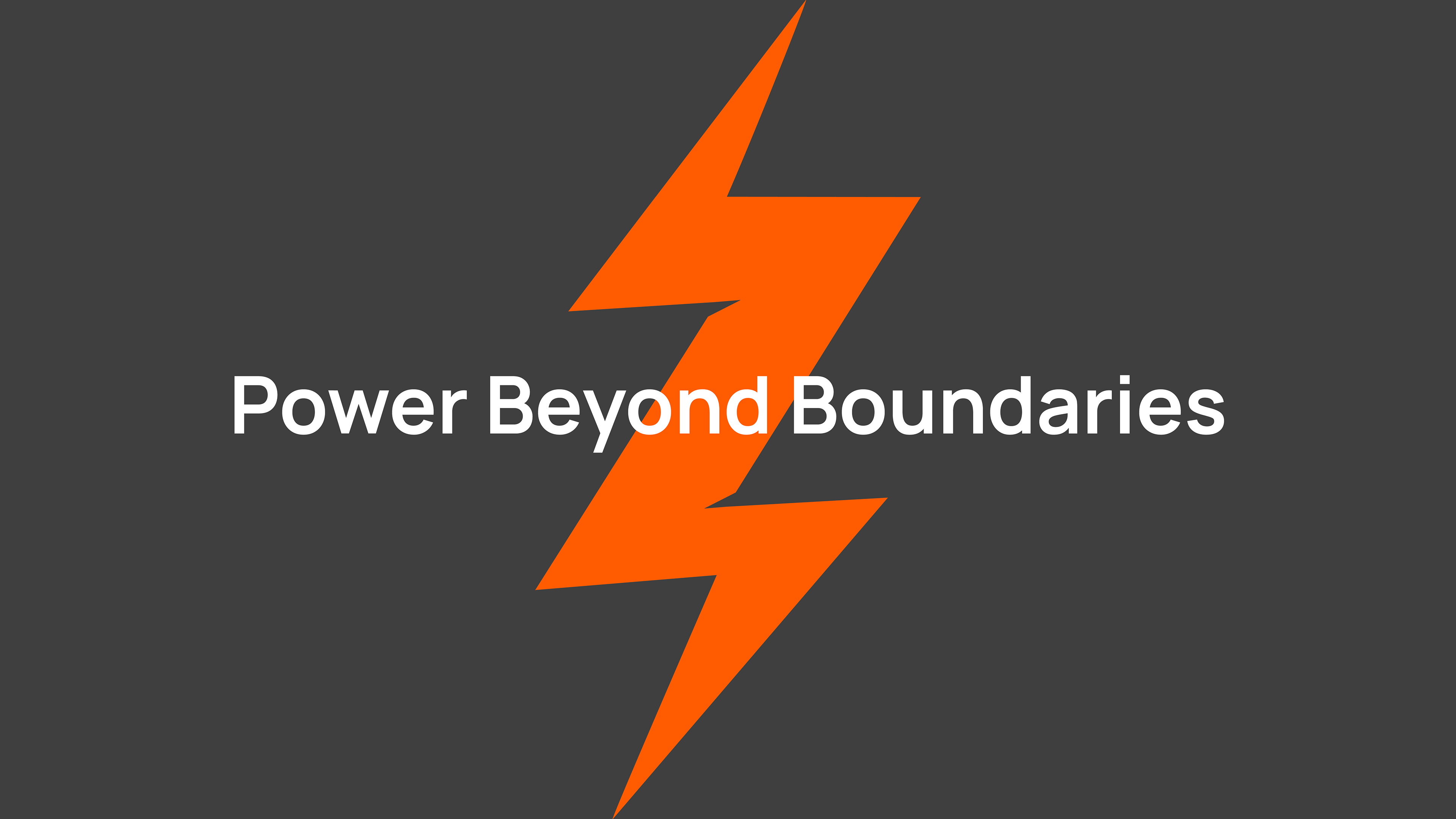
The icon was the most considered part of the project. At first read, it references a lightning bolt — direct and appropriate for the electrical sector. Look more carefully, and it resolves into the silhouette of a transformer. That kind of layered meaning doesn't announce itself, but it rewards attention — which is exactly the right register for a B2B brand earning trust over time.
The result is an identity built for the context Zeus operates in: precise, credible, and easy to trust.
Client: Zeus Power Supply · Agency: HeyNow! · Cleveland, OH · 2024
Role: Art Director / Brand Designer