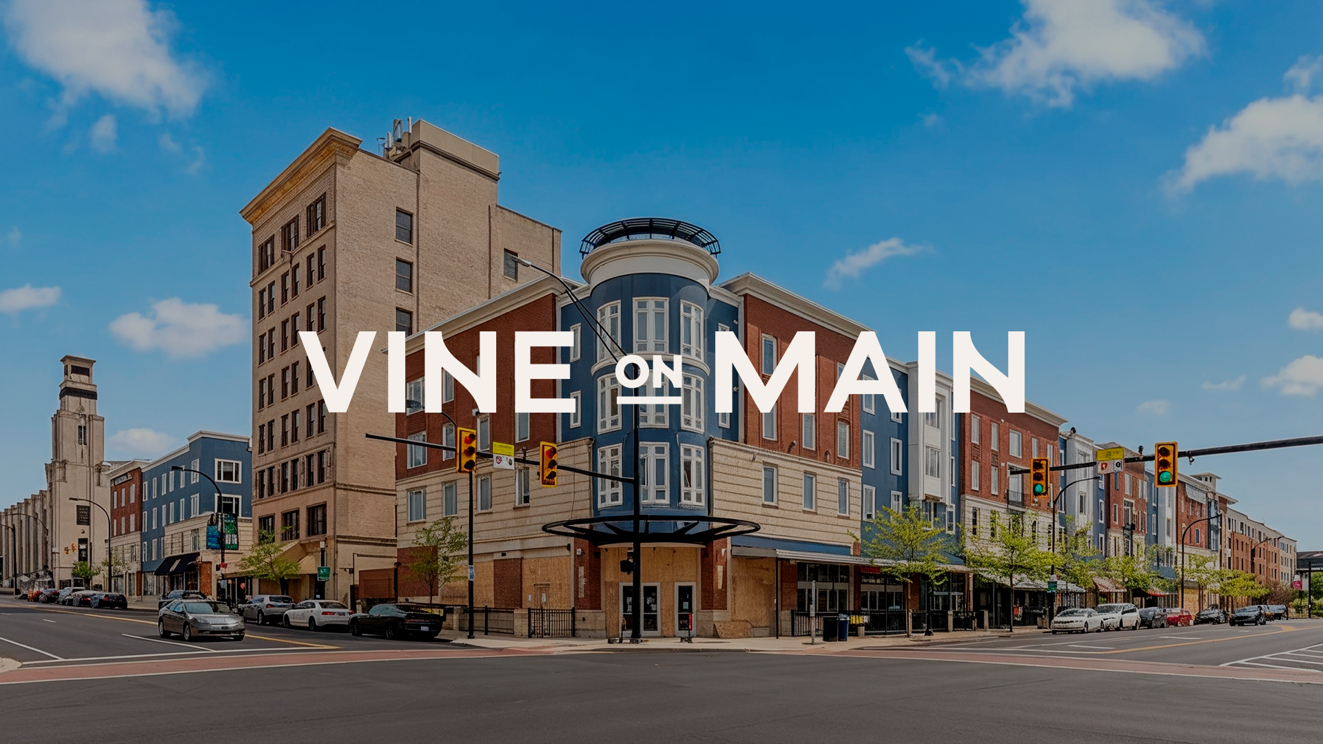
Vine on Main is a 236-unit apartment community located at the corner of Main and Exchange in downtown Akron, Ohio. The property was recently renovated, well managed, and already 93% occupied, but it did not have a brand story that reflected its location and role in the city.
The BrandDog strategy team developed the name and the idea behind it. During discovery, a longtime downtown Akron stakeholder described the city’s revitalization as a vine growing along a wall, gradually filling spaces that had been empty for too long. That image inspired the name. “Vine” represents steady, organic growth, while “on Main” gives the property a clear sense of place.
Working from that concept, I created the logo and full visual identity.
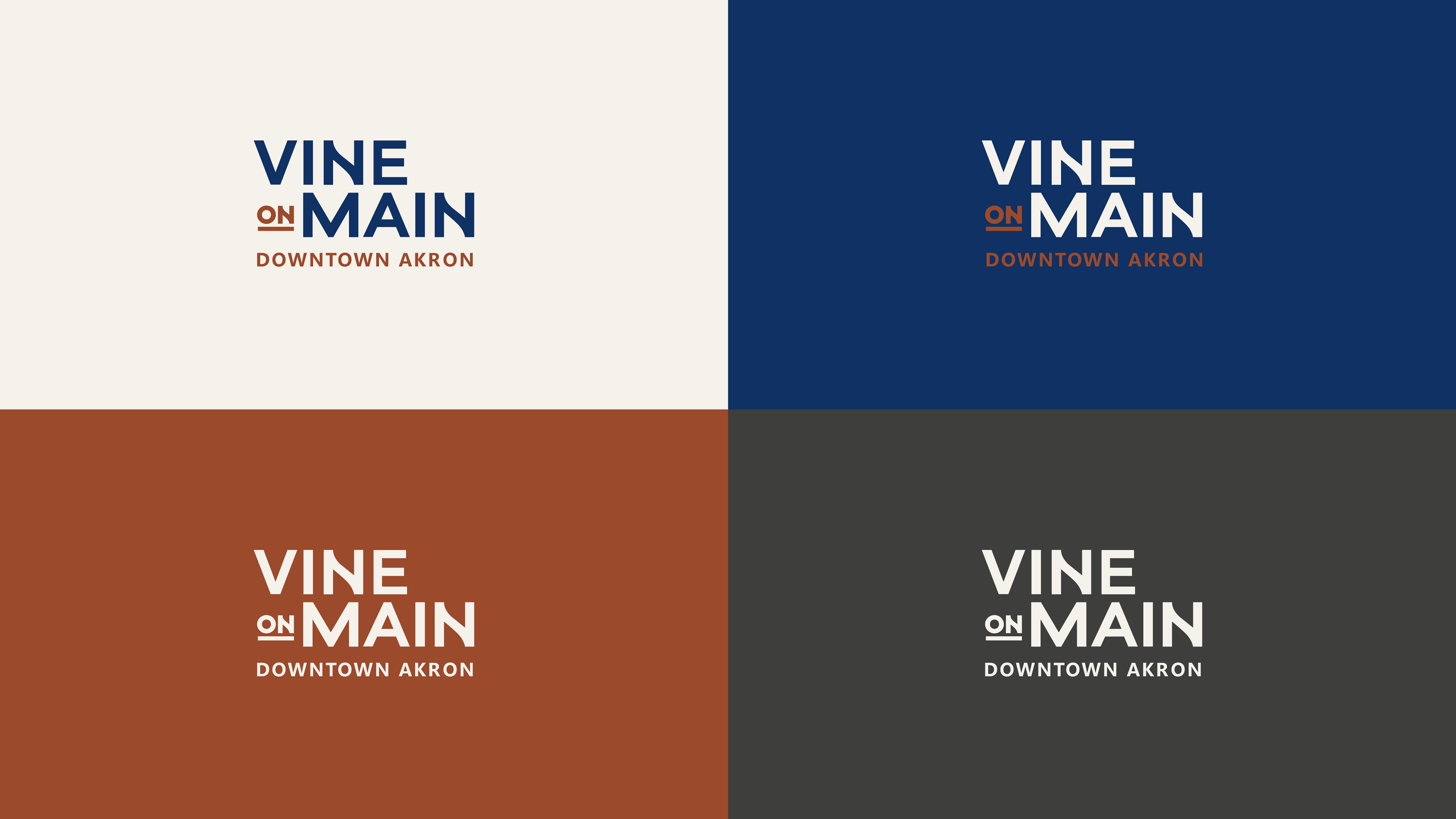
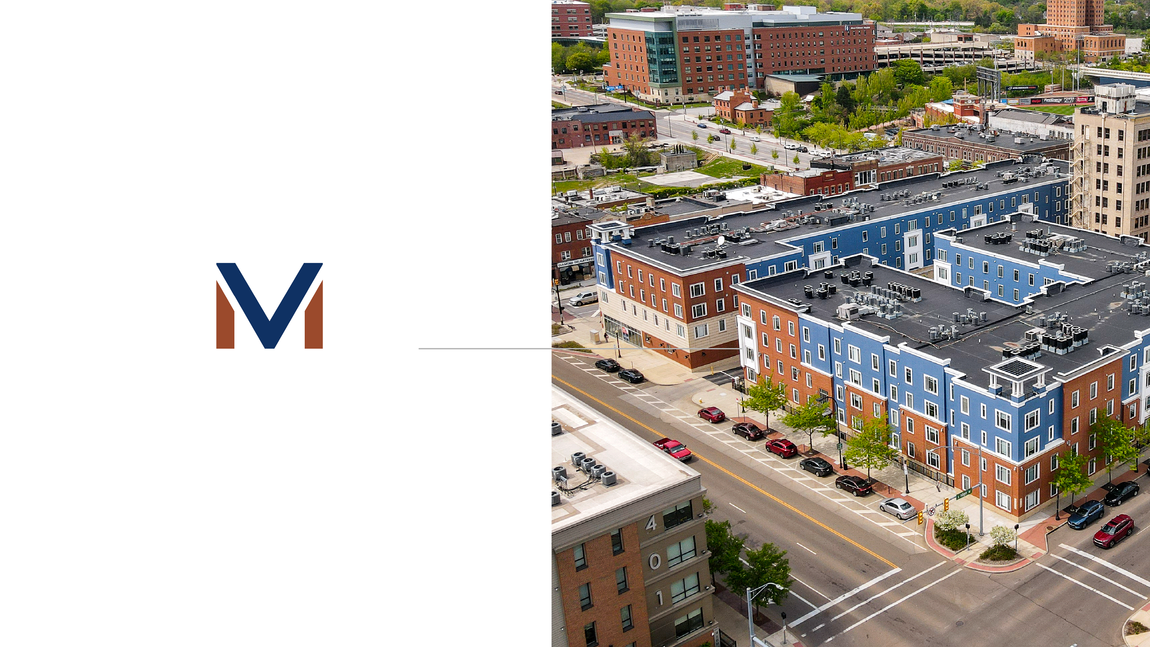
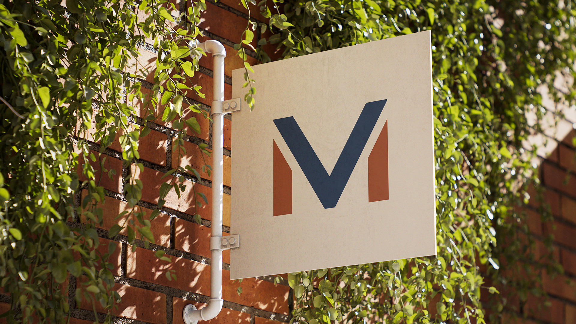
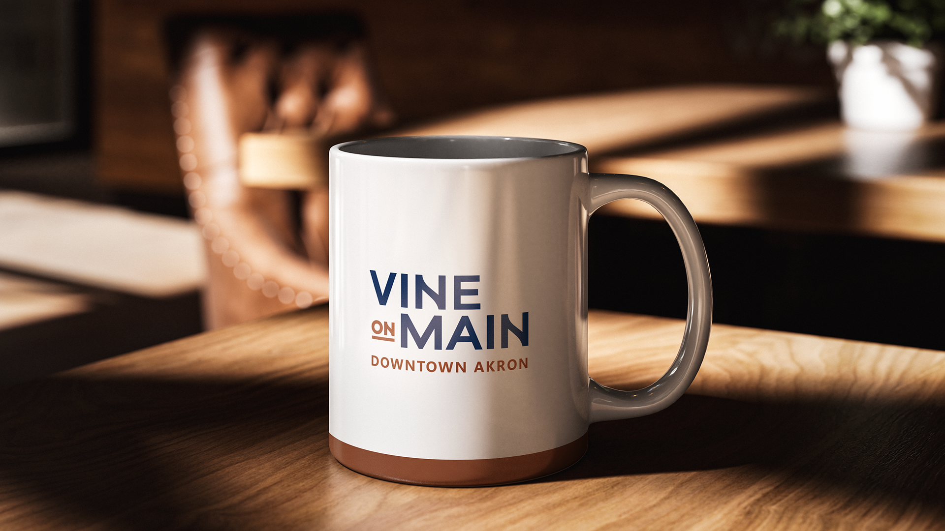
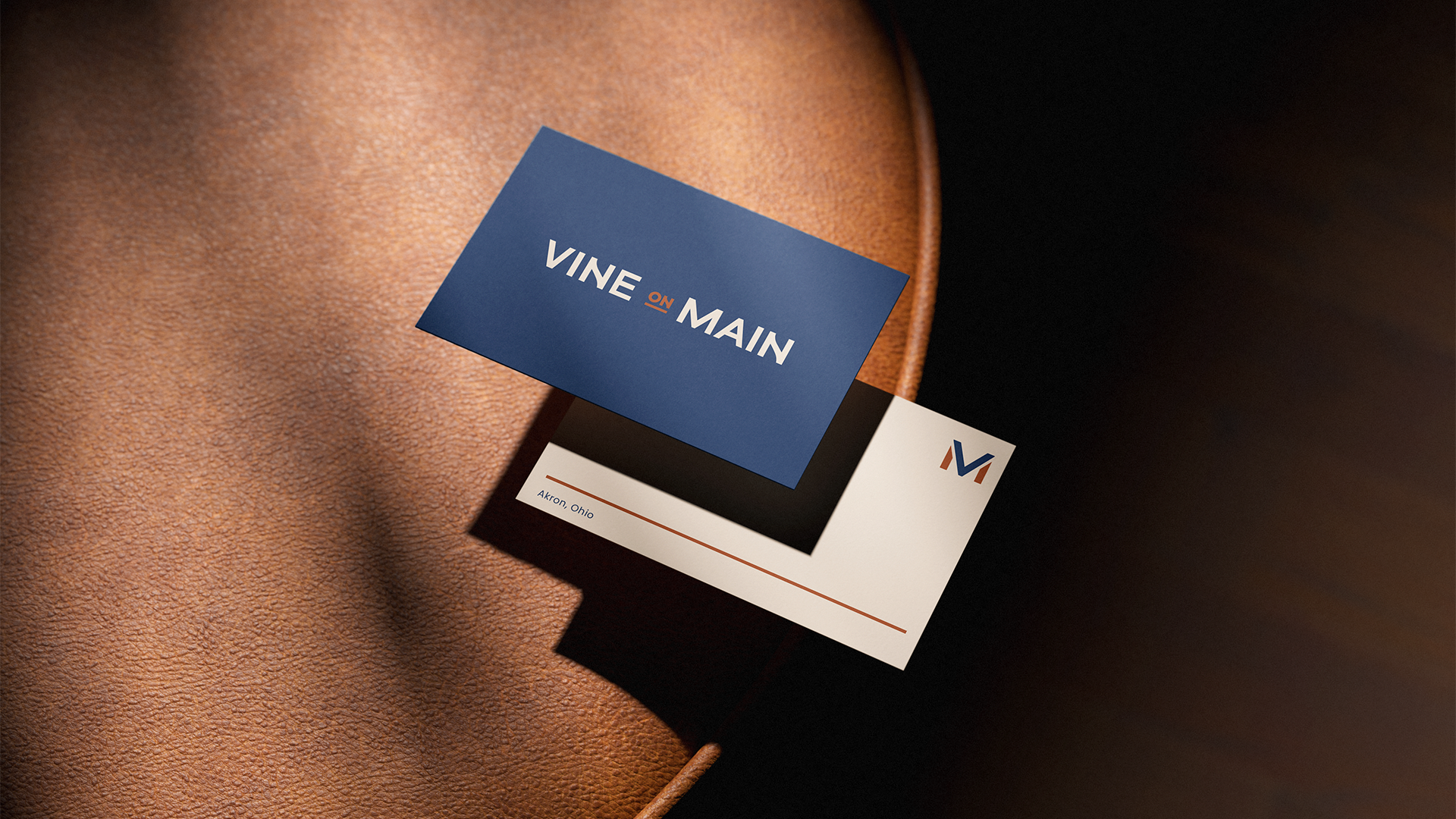
The wordmark places “on” between Vine and Main, turning it into a visual connection between growth and location. I also developed a compact VM monogram to give the brand a recognizable symbol for smaller applications.
The color palette combines deep navy, warm terracotta, and soft neutrals. Together, they give the brand a grounded, urban character while still feeling warm and residential. Clean typography, simple layouts, and location-focused photography keep the communication direct and easy to recognize.
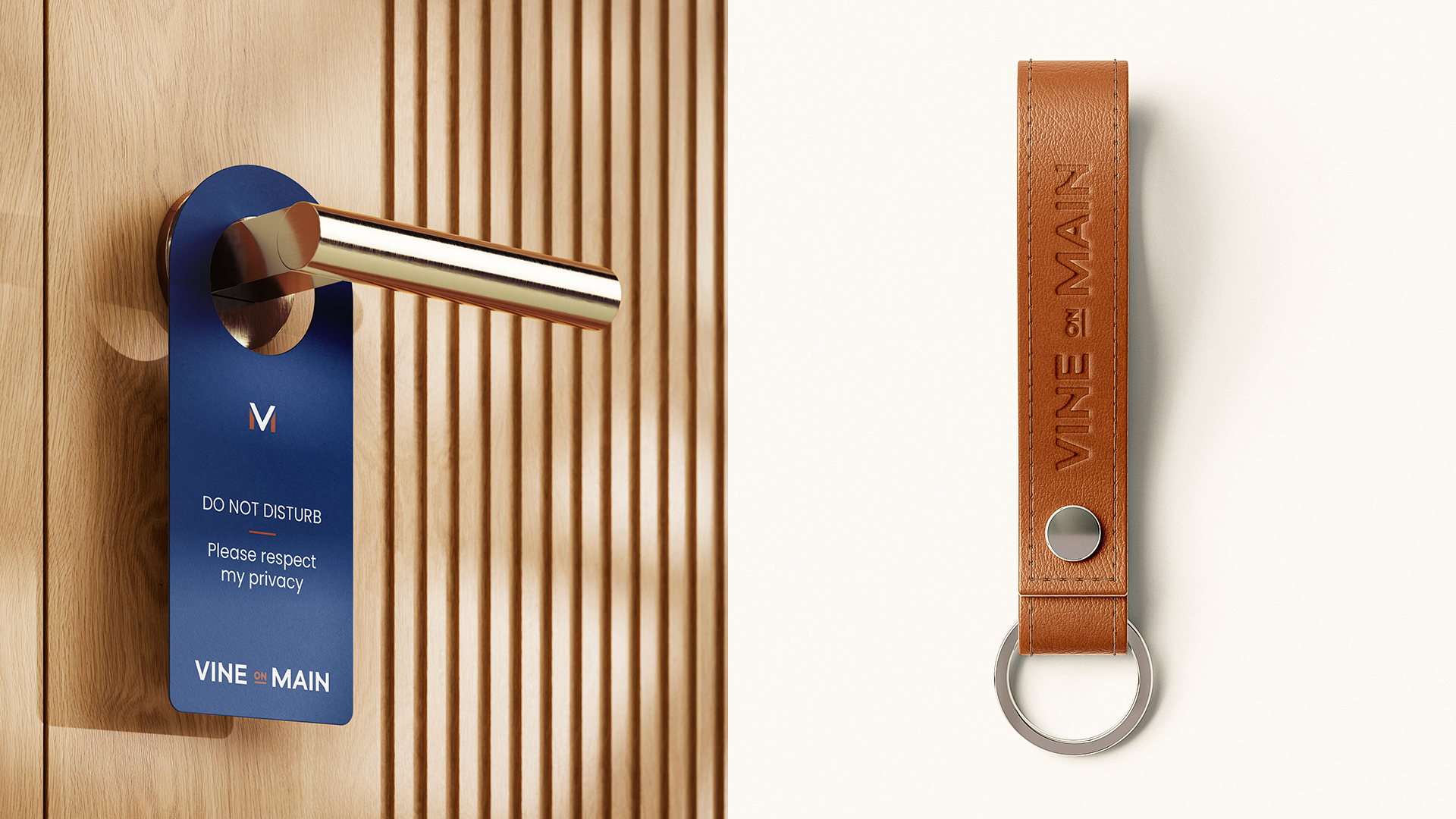
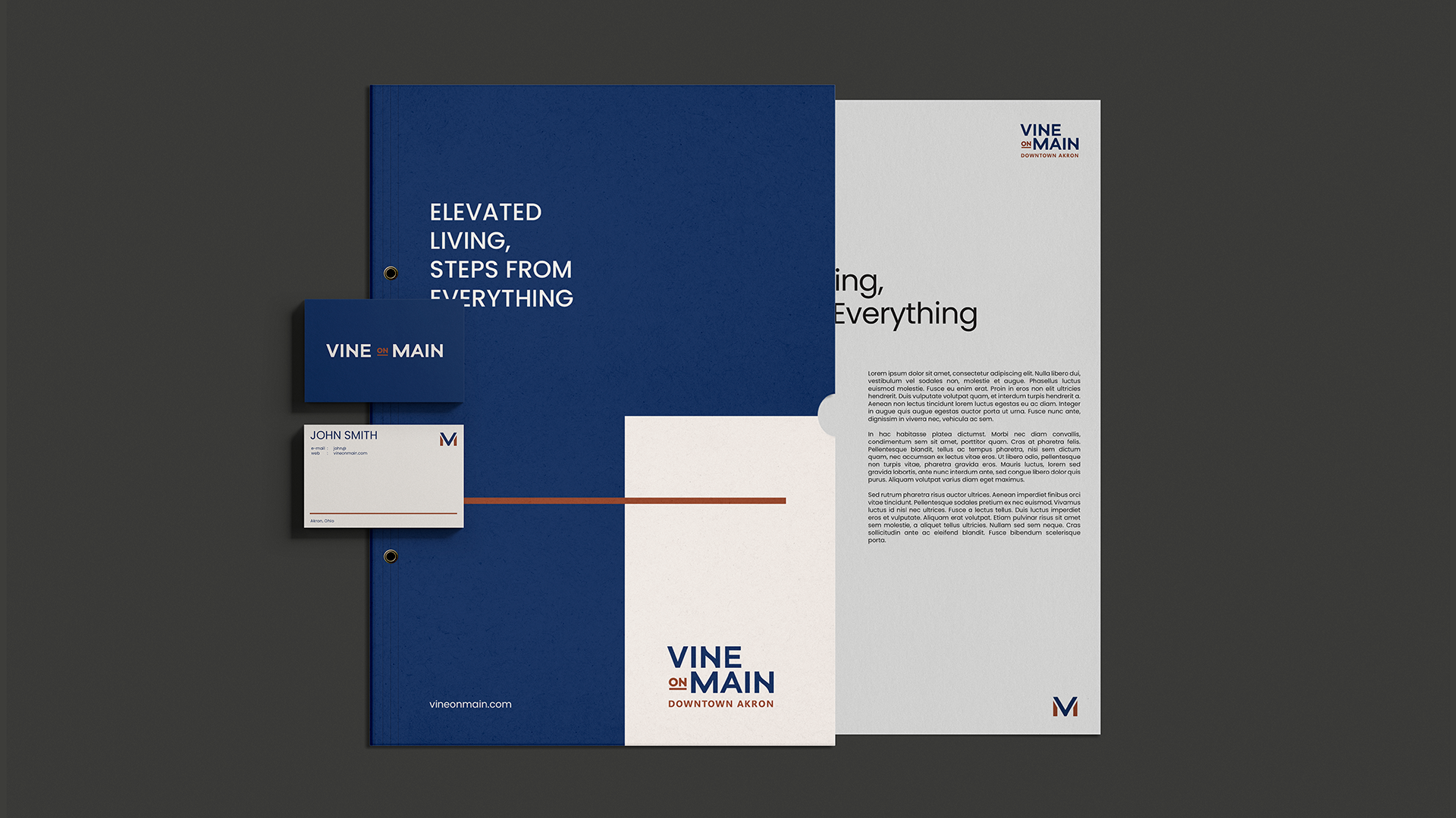
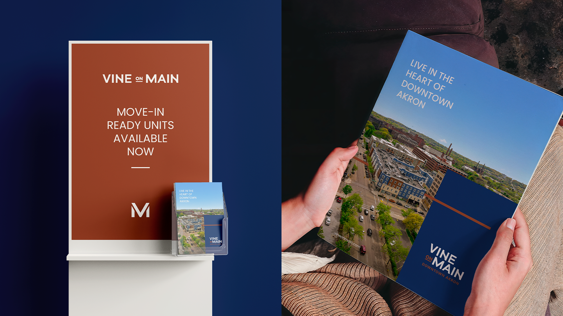
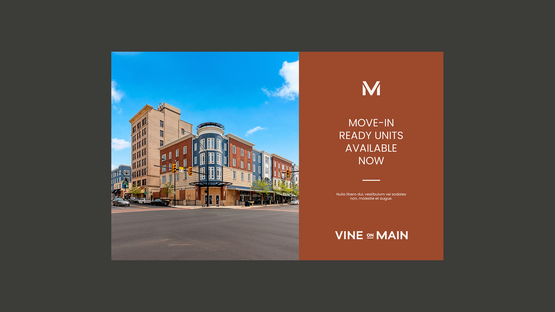
I extended the identity across leasing materials, brochures, business cards, digital advertising, property communications, and environmental applications. Every part of the system was designed to connect the building to downtown Akron and make its location a central part of the visual story.
The result is a brand that feels established, local, and connected to the continued growth of the city.
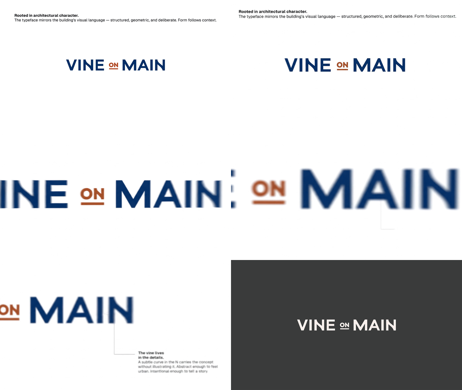
Looking at the building, what you see is blocked geometry, volumes that stack with precision, and a solid base that holds everything together.
The monogram translates exactly that: clean geometric forms, a structure that communicates stability.

Client: Vine on Main · Agency: BrandDog · Cleveland, OH · 2026
Scope: Logo Design, Visual Identity, Brand Applications.