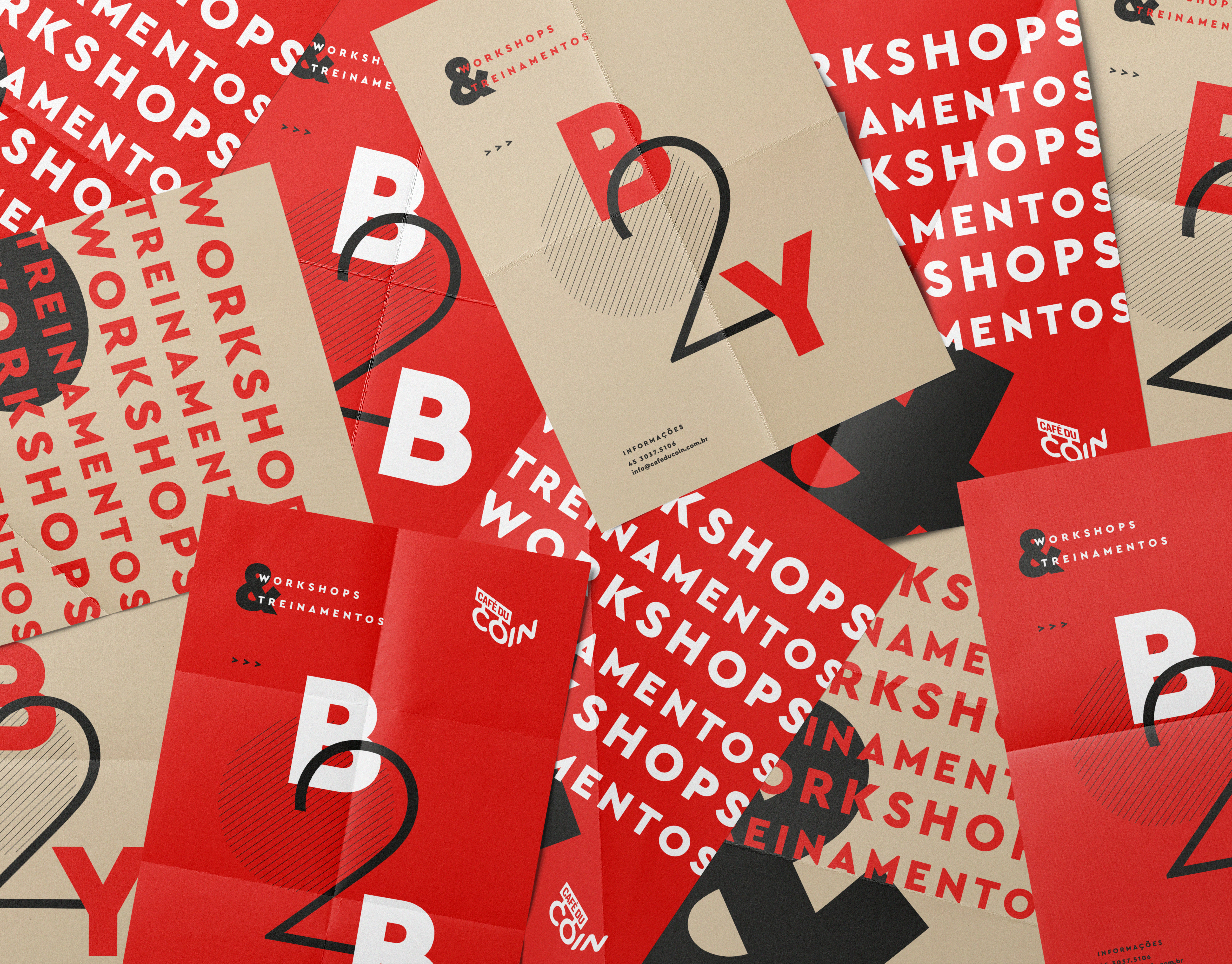
[EN]
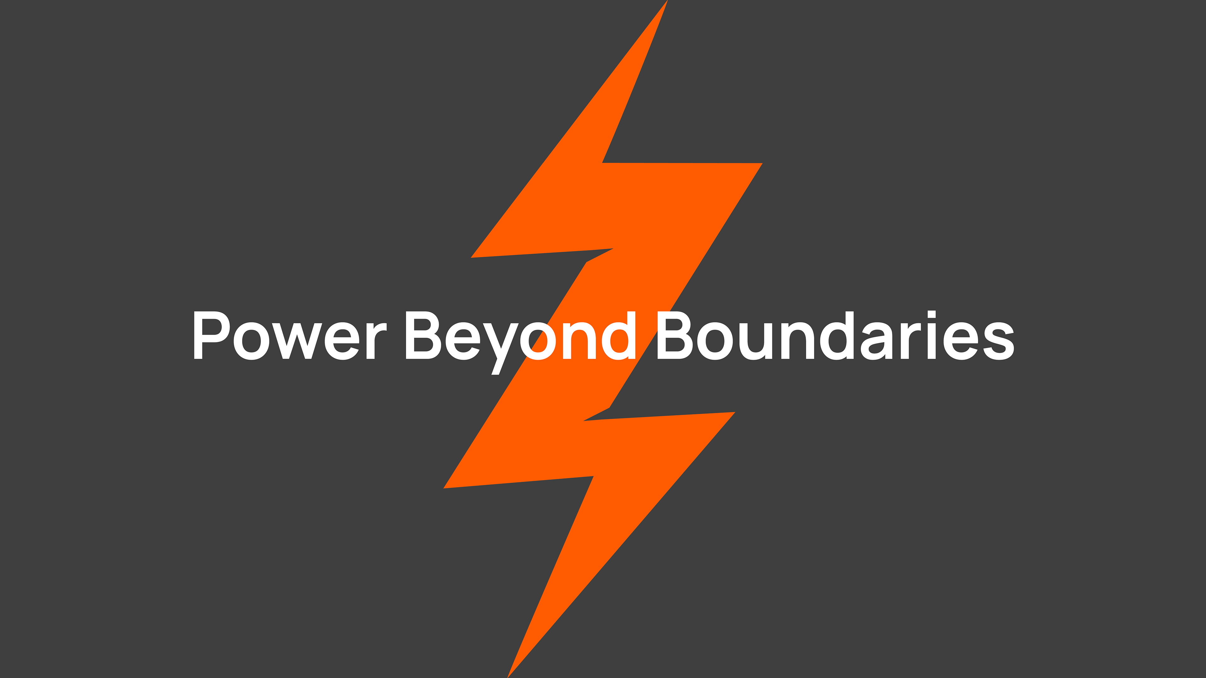
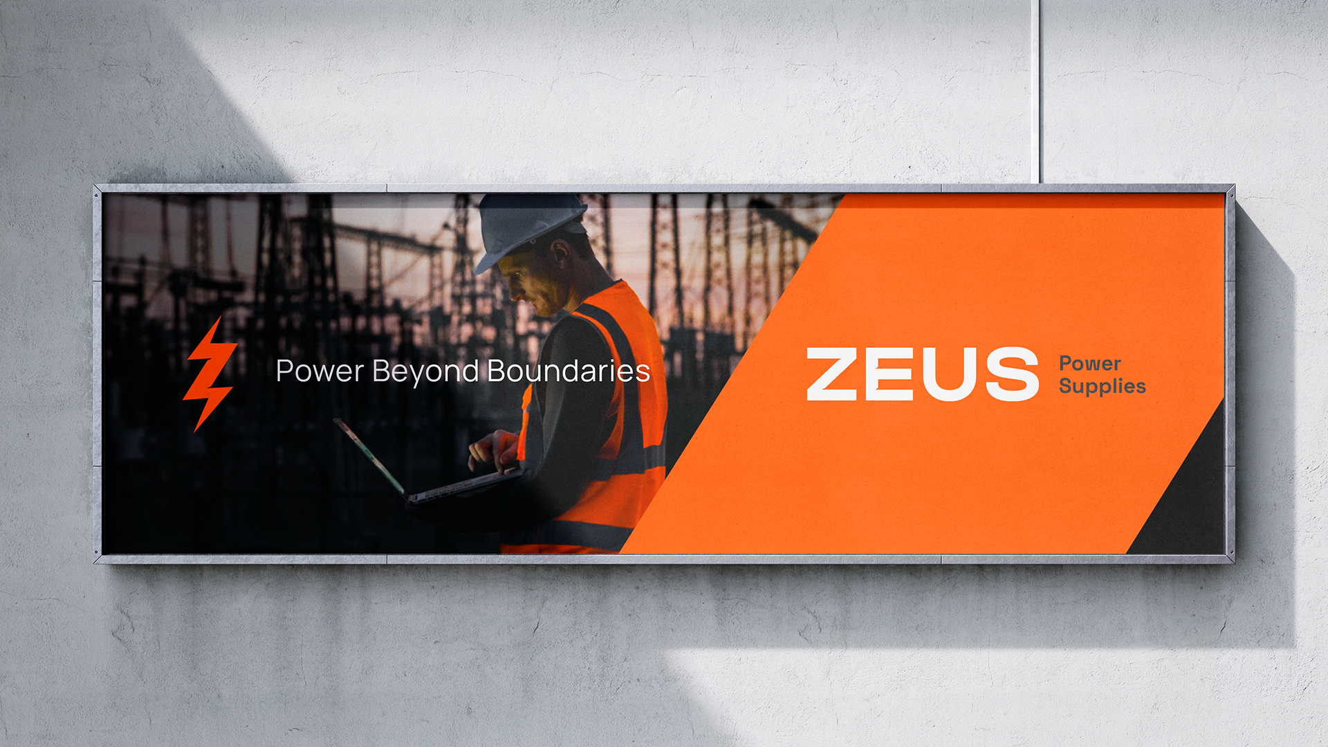
The goal of the rebranding was to position Zeus as the easiest choice for procurement teams in the electrical infrastructure sector.
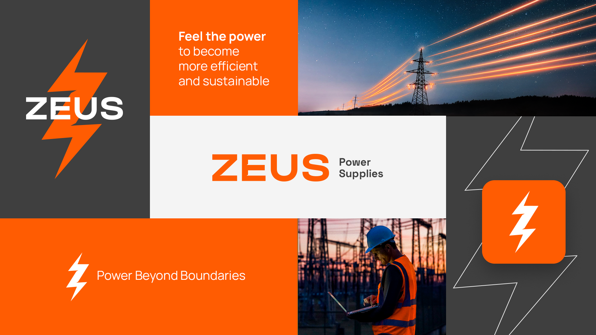
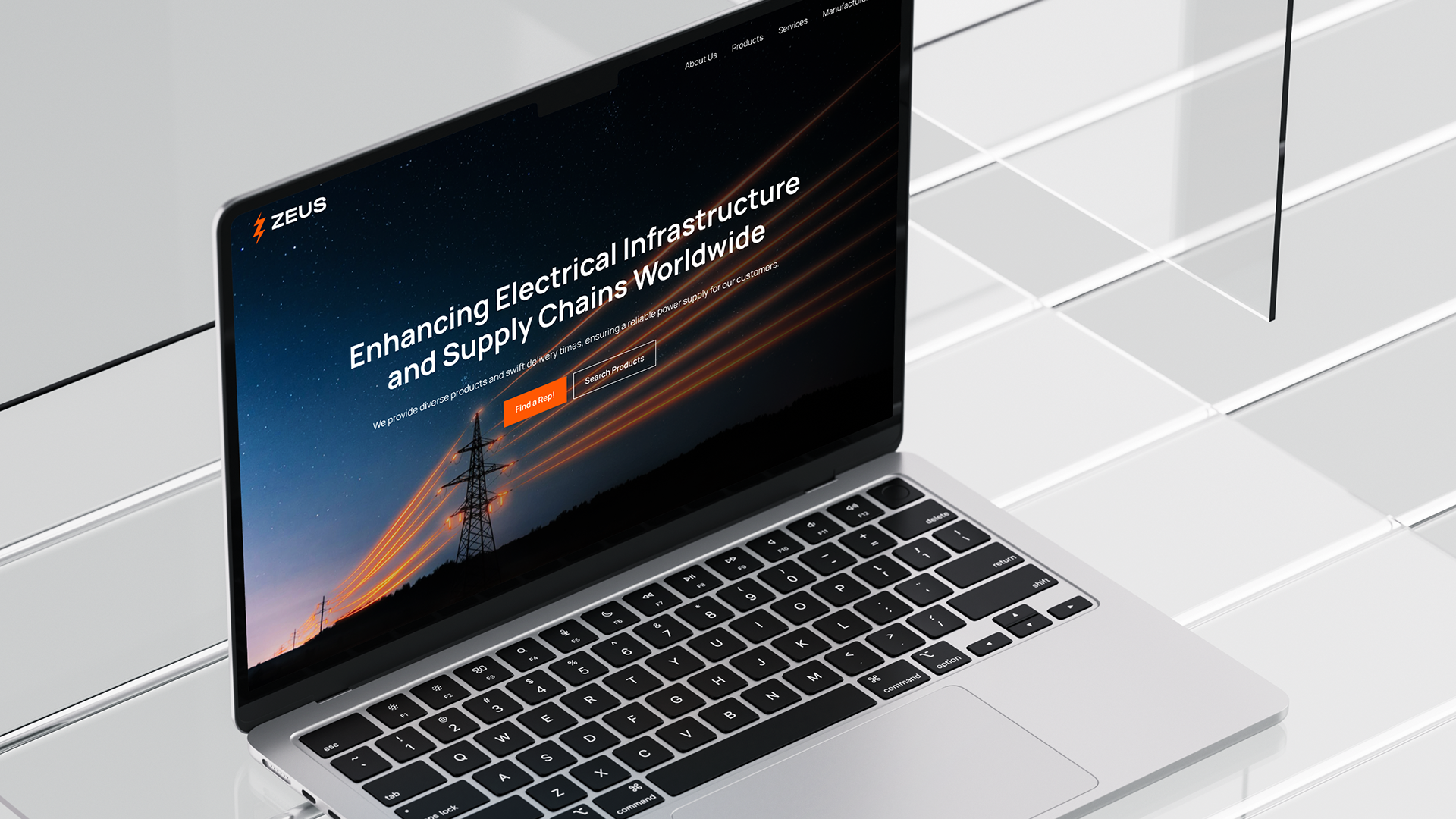
We updated their existing visual identity to communicate this message. We created something that showcases the Global Supply Chain that Zeus taps into, while also providing a fresh, modern take on their current brand.
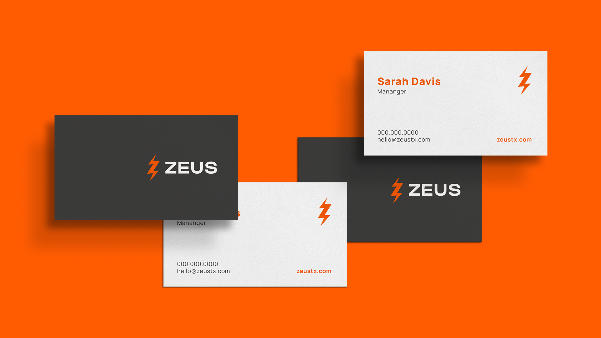
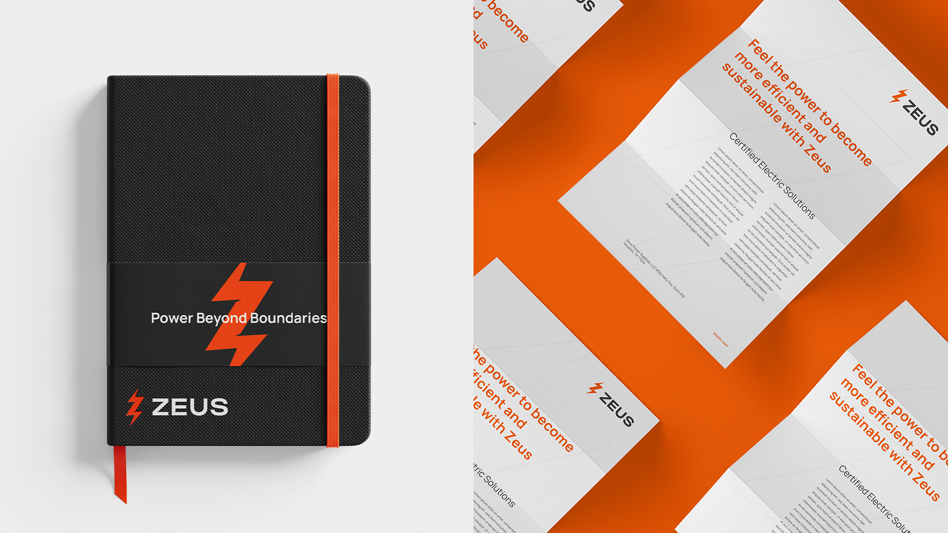
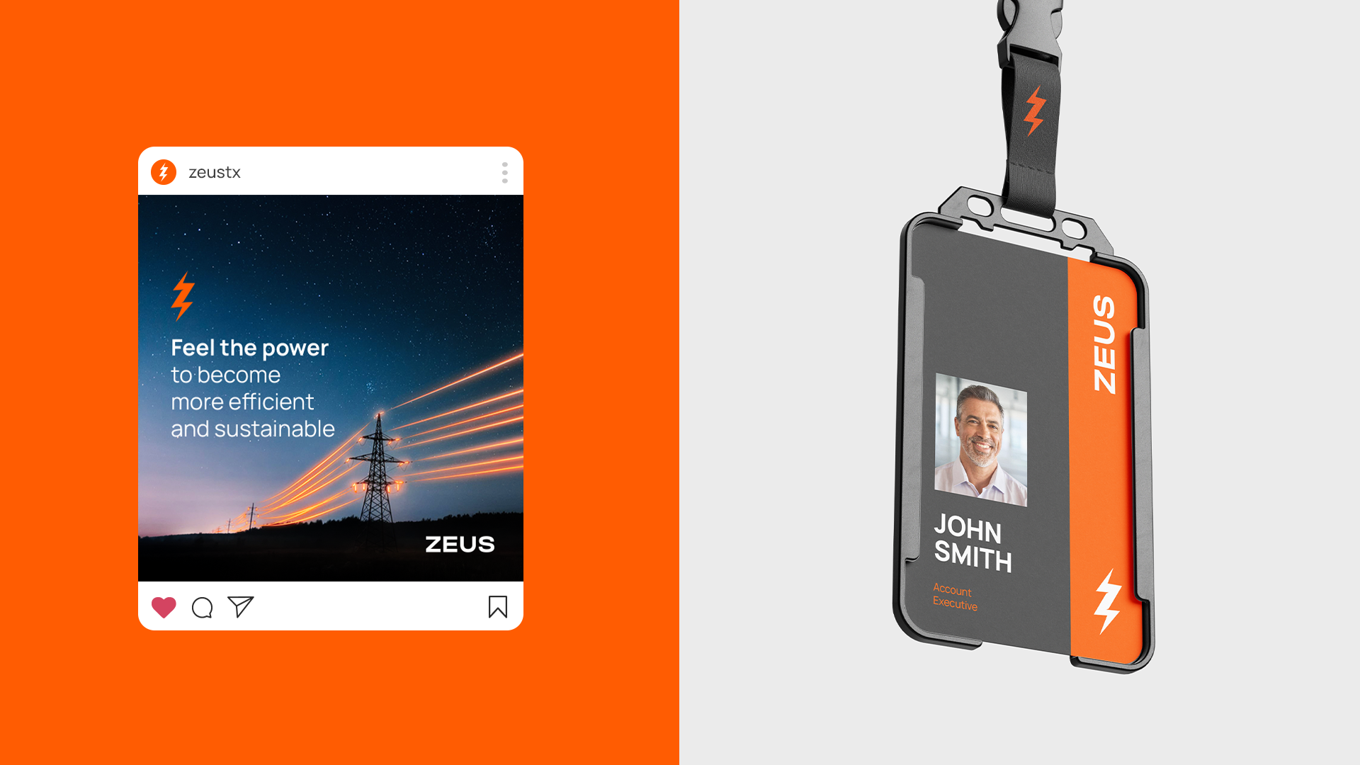
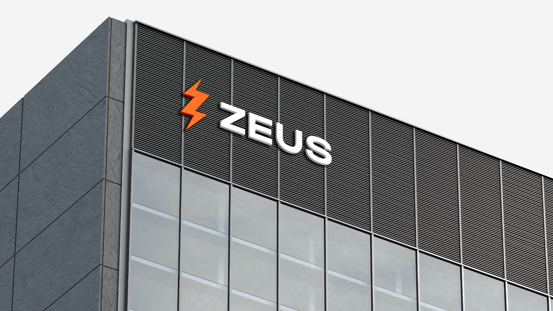
The color palette was refined but kept similar, and we introduced a new font, spending time selecting the right typeface to communicate partnership and peace of mind, while remaining modern and industrial. The logo achieves this with the altered Z and E in ZEUS.
If you look closely, you'll notice that the icon is not necessarily a lightning bolt, but rather the silhouette of the transformer itself.
[PT]
O objetivo do rebranding foi posicionar a Zeus como a escolha mais fácil para as equipes de compras no setor de infraestrutura elétrica.
Atualizamos a identidade visual existente para comunicar essa mensagem. Criamos algo que destaca a Cadeia de Suprimentos Global que a Zeus acessa, ao mesmo tempo que oferece uma visão renovada e moderna da marca atual.
A paleta de cores foi refinada, mas manteve-se semelhante, e introduzimos uma nova fonte, dedicando tempo à escolha do tipo certo para comunicar parceria e tranquilidade, mantendo uma aparência moderna e industrial. O logotipo alcança isso com as alterações nas letras Z e E em ZEUS.
Se você olhar de perto, perceberá que o ícone não é necessariamente um raio, mas sim a silhueta do próprio transformador.
Client: Zeus Power Supply
Agency: HeyNow!
Cleveland, OH
Agency: HeyNow!
Cleveland, OH
2024
Art Director / Graphic Design: Jessica Kuhn